Sales Overview Dashboard (PowerBI)
Retail Dashboard Series (1/3)
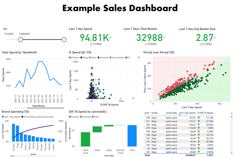
Sales Dashboard (Image by Author)
If you are interested in articles related to my experience, please feel free to contact me: linkedin.com/in/nattapong-thanngam
This article is part of a series about Retail Dashboard_. (Part 1: Sales Overview Dashboard),(Part 2: Product detail and Store Dashboard),_ and (Part 3: Customer dashboard and Cohort Analysis)
The same data set of Customer Analytics_._ (Part 1: Customer Profiling with Descriptive Analytics with SQL),(Part 2: Customer Segmentation with Clustering), (Part 3: Market Basket Analysis), and (Part 4: Product Recommendation)
Note:
- Data set from Dunnhumby_Carbo-Loading
- Objective: To show key information that I think it should have in the dashboard.
1. Slicer
- Convert day = 1 as 1 Jan 2021 (assume)
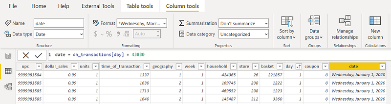
The formula in PowerBI (Image by Author)
- Create Date_Table → Year, Month, …, YearQuarter and YearMonth
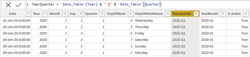
The formula in PowerBI (Image by Author)
- Mark as data Table and link to dh_transaction
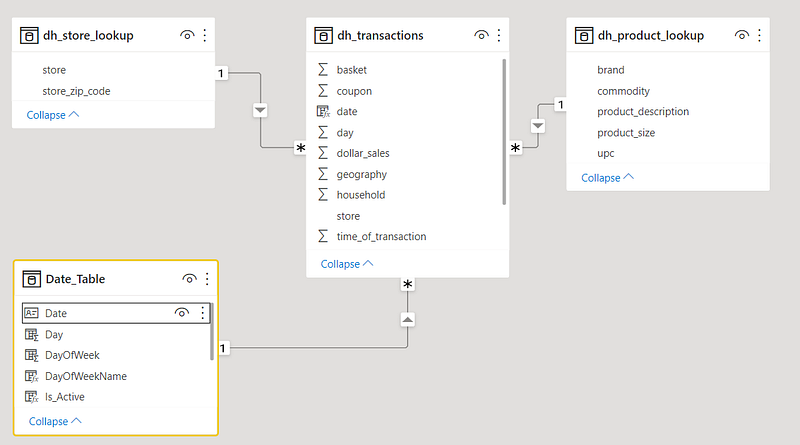
Schema (Image by Author)
- Visualization: Slicer
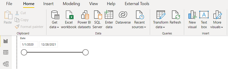
PowerBI dashboard (Image by Author)
2. Last 7 days spending vs Prev last 7 days spending
- Create new measures “Last 7 day spend” and “Prev. last 7 days”
- Visualization: KPI, Setting as below
- Do it again for “Total basket” and “Average Basket Size”
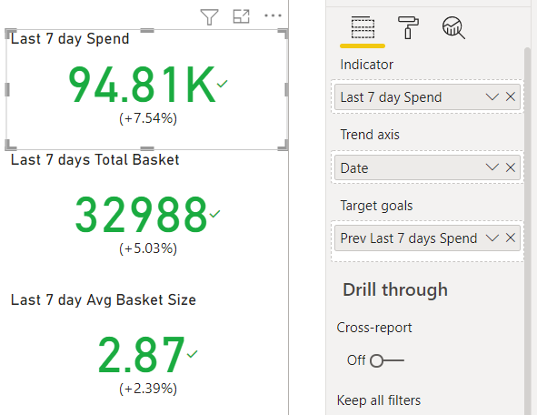
Select fields (Image by Author)
- Total Spending, Total Basket, and Averager Basket size are important parameters for sales monitoring.
3. Total Spending Trend
- Create Date hierarchy: YearQuarter and YearMonth
- Visualization: Line Chart, Setting as below
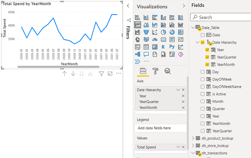
Select fields (Image by Author)
- Spending trend line able to show normal/abnormal trend. Useful for monitoring.
4. Pareto_Chart for Top revenue brands
- Create new measures: “Cumulative 7d Spend by Brands” and “% Cumulative Spend by brands”
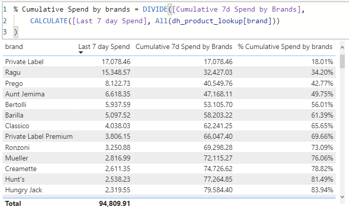
The formula in PowerBI (Image by Author)
- Visualization: Line and clustered column chart, Setting as below
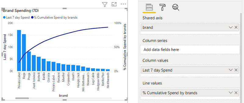
Select fields (Image by Author)
- Pareto charts can filter important items that we have to seriously monitor.
- Note: Only Pareto chart idea. The level of products (product group, brand, SKU) depends on user’s requirement.
5. Spending vs Different
- Create a new measure: “% Diff 7 days spending”
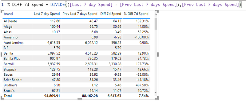
The formula in PowerBI (Image by Author)
- Visualization: Scatter chart, Setting as below
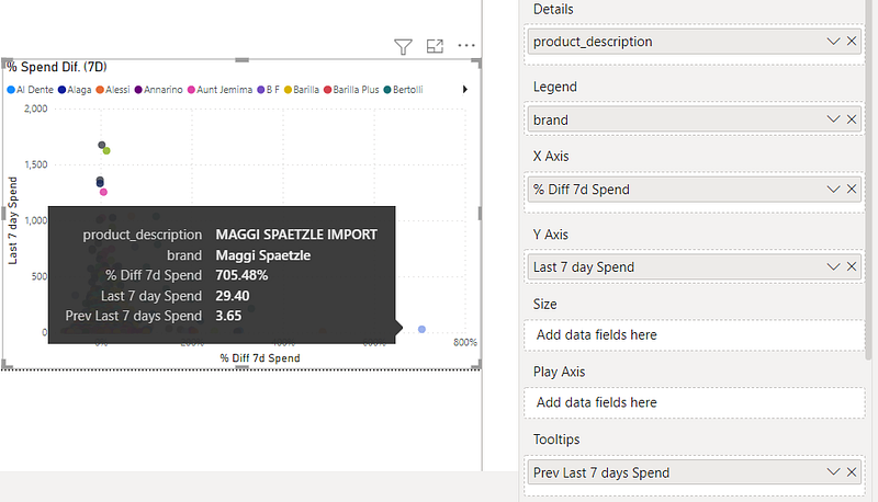
Select fields (Image by Author)
- Right area → Trendy products. MAGGI SPAETZLE IMPORT has 705.48% sale increase (3.65 to 29.40). Useful information to create future action.
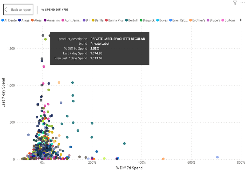
Scatter plot (Image by Author)
- Top area → Key products. PRIVATE LABEL SPAGHETTI REGULAR has 7 days sale as 1,674.05 that 2.54% sale increase. Useful information to create future action.
6. Waterfall chart
- Visualization: Waterfall chart, Setting as below
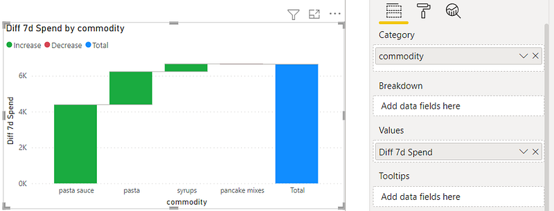
Select fields (Image by Author)
- Waterfall chart show movement and impact of class (commodity, brands, store region, etc.)
7. Others
- Period over Period: Same concept of Spending vs Different. Useful information to monitor sale performance.
- Table. → Raw data is very useful for the interaction dashboard
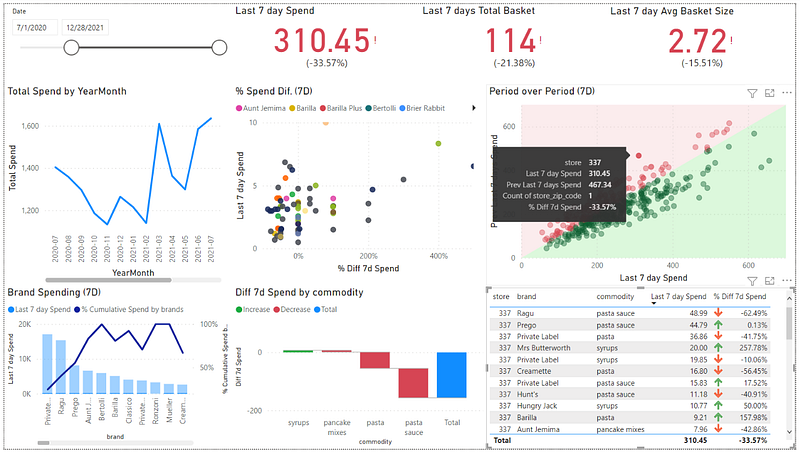
Store 337 performance(Image by Author)
- Example: Store 337
- 7D sales drop 33.57%, Number of basket drop 21.38%, and Average Basket Size drop 15.51%.
- Ragu_Paste sauce (Top spending product) has sales drop 62.49%
- Pasta sauce has significant sale drop
Note:
- Thank you skooldio for an excellent course (Hand-on PowerBI).
Please feel free to contact me, I am willing to share and exchange on topics related to Data Science and Supply Chain.
Facebook: facebook.com/nattapong.thanngam
Linkedin: linkedin.com/in/nattapong-thanngam
Originally published on Medium
Related

A Practical Guide to Building Agents
คู่มือปฏิบัติ: การสร้าง Agent ด้วย LLM โดย OpenAI

AI in the Enterprise โดย OpenAI
ถอดรหัสเคล็ดลับองค์กรระดับโลก ปลดล็อกศักยภาพ AI สร้างความได้เปรียบทางธุรกิจ
Best Practices for Bar Charts
Visualization Series — Episode 2

Best Practices for Line Charts
Visualization Series — Episode 3