Best Practices for Bar Charts
Visualization Series — Episode 2
Connect with me and follow our journey: Linkedin, Facebook
Welcome back to the Visualization Series!
In this series, we explore the world of data visualization, breaking down best practices to help you create effective and insightful charts. In the first episode, we discussed pie charts and when to use them.
As part of this series, you can explore best practices for various chart types, including:
Now, in this second episode, we focus on one of the most versatile chart types: the bar chart.
Introduction to Bar Charts
Bar charts are a fundamental tool for comparing categorical data. They use rectangular bars to represent values, making it easy to compare different categories at a glance. Bar charts excel when you need to:
- Compare multiple categories
- Show rankings or trends over time (using grouped bars)
- Display data clearly and accurately
However, like any visualization, a poorly designed bar chart can mislead or confuse your audience. In this post, we’ll go over best practices for creating effective bar charts, along with good and bad examples.
Best Practices for Bar Charts
To make your bar charts clear and effective, follow these best practices:
📌 Note: If you want to see the final best-practice version, please jump to the last section, where we demonstrate step-by-step improvements.
General Guidelines Before Applying Best Practices:
Note: Since dashboard tools like Power BI and Tableau may not fully support certain customizations (Topics A–E), I’d like to introduce these considerations first. Understanding these principles will help you design more effective bar charts, even when working within tool limitations.
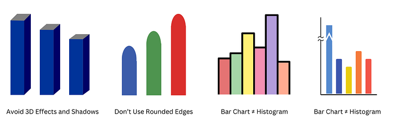
- A) Avoid 3D Effects and Shadows: These distort perception and make values harder to compare.
- B) Don’t Use Rounded Edges: Rounded bars can make alignment and interpretation harder.
- C) Bar Chart ≠ Histogram: Bar charts compare categories, whereas histograms show distributions.
- D) Don’t Break the Bar Axis: Distorting the axis can misrepresent data and lead to false interpretations.
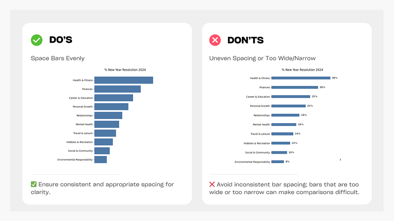
- E) Space Bars Evenly: Ensure consistent and appropriate spacing for clarity.
Now that we’ve covered some general principles, let’s dive into the best practices that will help you create clear and effective bar charts.
1. Use Consistent Colors
✅ Use one color for all bars unless highlighting a key data point.
❌ Avoid using too many colors, as it can distract from the message.
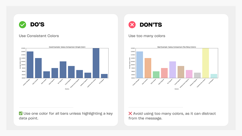
Figure: Consistent vs. Multiple Colors in a Bar Chart
2. Use a Zero Baseline
✅ Always start the y-axis at zero for accurate comparisons.
❌ Avoid starting above zero, as it can exaggerate differences and mislead readers.
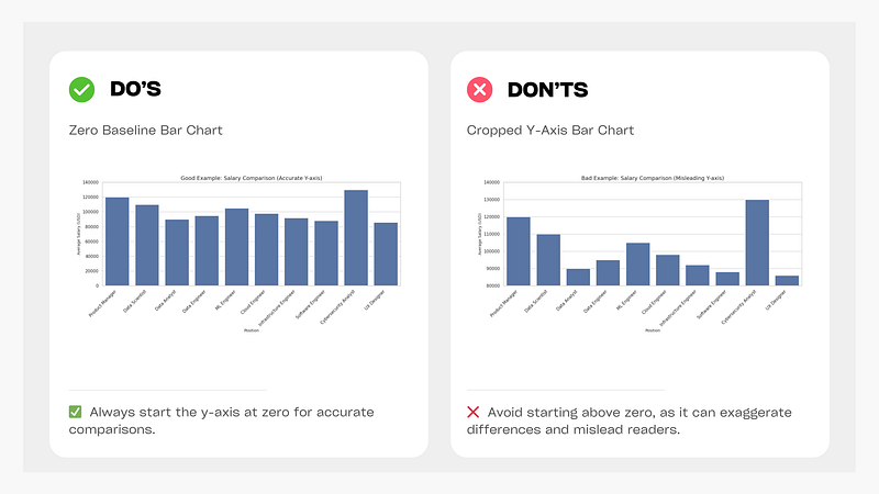
Figure: Zero Baseline vs Cropped Y-Axis Bar Chart
3. Sort Bars for Easy Comparison
✅ Sort bars in descending or ascending order to make patterns clear.
❌ Avoid randomly ordered bars, which make comparisons difficult.
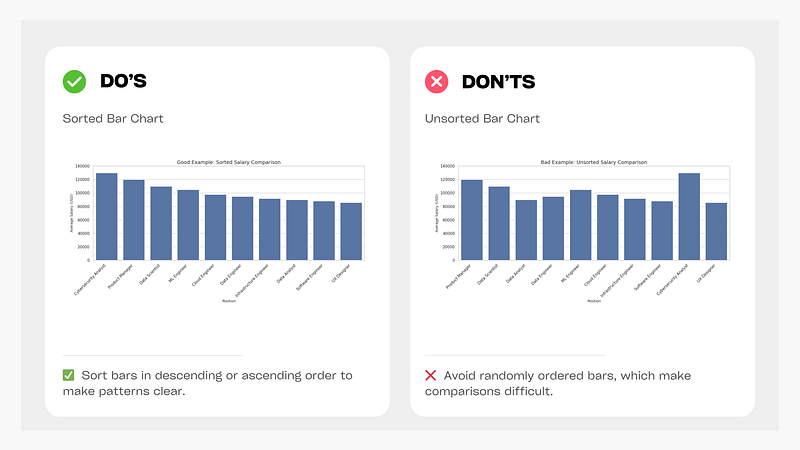
Figure: Sorted vs. Unsorted Bar Chart
📌 Note: If your data follows a logical order, such as age intervals or dates, maintain that order instead of sorting numerically.
4. Use Horizontal Bars for Long Labels
✅ Use a horizontal bar chart if category names are long.
❌ Avoid vertical bar charts with long labels, as they become hard to read.
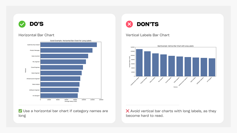
Figure: Horizontal vs. Vertical Labels Bar Chart
5. Direct Labels on Bars for Clarity
✅ Place labels directly on bars to make values immediately visible and easy to interpret.
✅ Clean charts with axis + grid: Uses grid lines to improve readability but still lacks direct value labels on bars.
❌ Avoid the default black border, as it clutters the chart and reduces clarity.
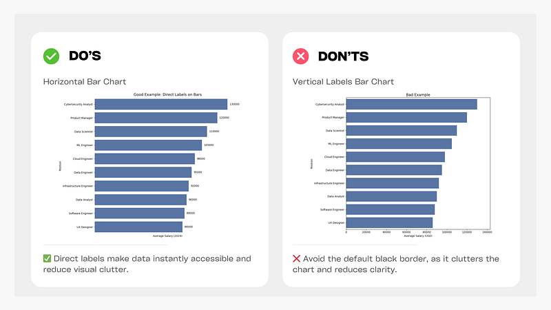
Figure: Direct Labels vs. Default (Black Border) Bar Chart
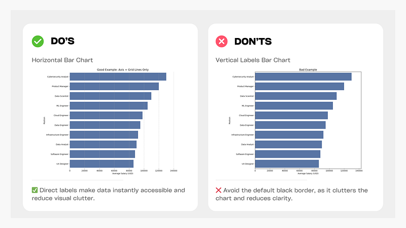
Figure: Clean Charts with Axis + Grid vs. Default (Black Border) Bar Chart
6. Use Color Efficiently
✅ Use color intentionally to highlight or alert specific categories that need focus.
❌ Avoid using multiple colors without a clear purpose, as it can create unnecessary visual clutter.
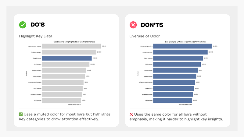
Figure: Highlighted Bar Chart vs Unfocused Bar Chart (All One Color)
By following these best practices, you can create bar charts that are visually clear and easy to interpret. Bar charts are excellent for comparing categories, but they may not always be the best option for displaying continuous trends over time. If you need to show patterns or relationships across time, line charts might be a better choice.
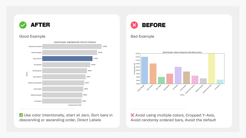
Figure: Before and After Bar Chart Improvements
🚀 Stay tuned for the next episode, where we’ll explore Best Practices for Line Charts! 🚀
Data Science Explore the world of data science with Donato_Story
Dashboard Discover the power of data visualization with Donato_Story
Donato_Journey Join me on my journey (Thai version)
Course_Review Discover the training courses with Donato_Story (Thai version)
Let’s Connect!
Your thoughts and feedback are invaluable. Feel free to share them in the comments or connect with me on
- Medium: medium.com/donato-story
- Facebook: web.facebook.com/DonatoStory
- Linkedin: linkedin.com/in/nattapong-thanngam
Originally published on Medium
Related

A Practical Guide to Building Agents
คู่มือปฏิบัติ: การสร้าง Agent ด้วย LLM โดย OpenAI

AI in the Enterprise โดย OpenAI
ถอดรหัสเคล็ดลับองค์กรระดับโลก ปลดล็อกศักยภาพ AI สร้างความได้เปรียบทางธุรกิจ

Best Practices for Line Charts
Visualization Series — Episode 3
Best Practices for Pie Charts
Visualization Series — Episode 1