Best Practices for Pie Charts
Visualization Series — Episode 1

Connect with me and follow our journey: Linkedin, Facebook
Welcome to the Visualization Series! In this series, we will explore the fascinating world of data visualization. From simple to complex charts, we’ll learn how to use visuals effectively to communicate your insights and make data-driven decisions.
As part of this series, you can explore best practices for various chart types, including:
In this first episode, we’re diving into one of the most popular (and often misused) chart types: the pie chart.
Introduction to Pie Charts
Pie charts are a common way to visualize data, especially when showing parts of a whole. They represent data as slices of a circle, where each slice’s size corresponds to a proportional value. While they can be useful for showing simple proportions, pie charts also have limitations, and it’s important to use them correctly. In this blog post, we’ll explore the best practices for creating pie charts, so that you can create clear and understandable visualizations.
Best Practices for Pie Charts
To make your pie charts more effective, follow these best practices with do and don’t examples.
📌 Note: If you want to see the final best practice version, please jump to the last section, as I will demonstrate the improvement step by step.
1. Use a Simple, Flat Design
✅ Use a simple, flat design for better clarity.
❌ Avoid 3D pie charts; they distort proportions and make data harder to interpret.
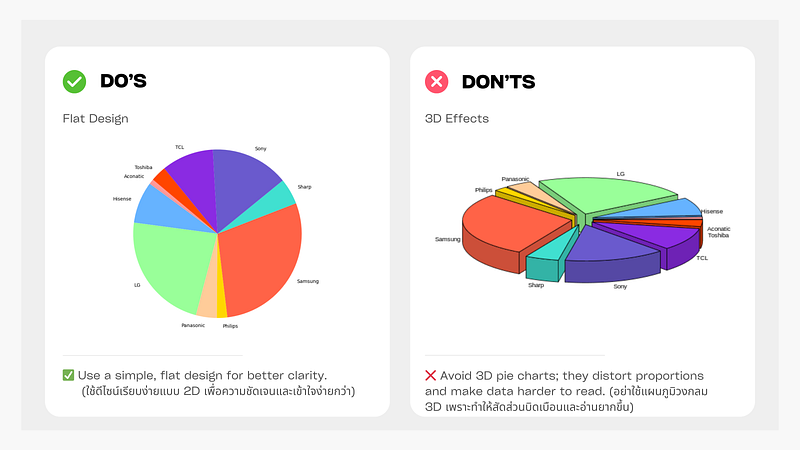
Figure: Flat Design vs 3D Effects Pie Chart
2. Limit the Number of Categories
✅ Keep it simple with 3–5 categories for clarity.
❌ Avoid using a pie chart with too many categories; use a bar chart instead.
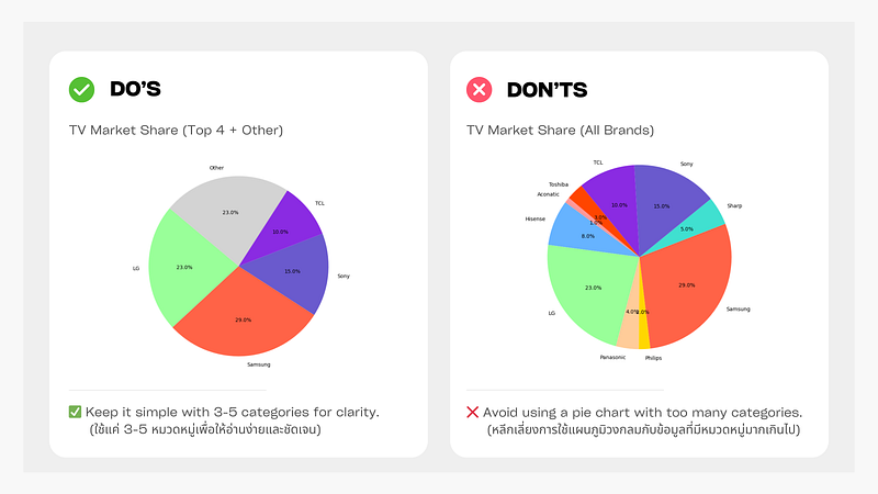
Figure: 5 Categories vs 10 Categories Pie Chart
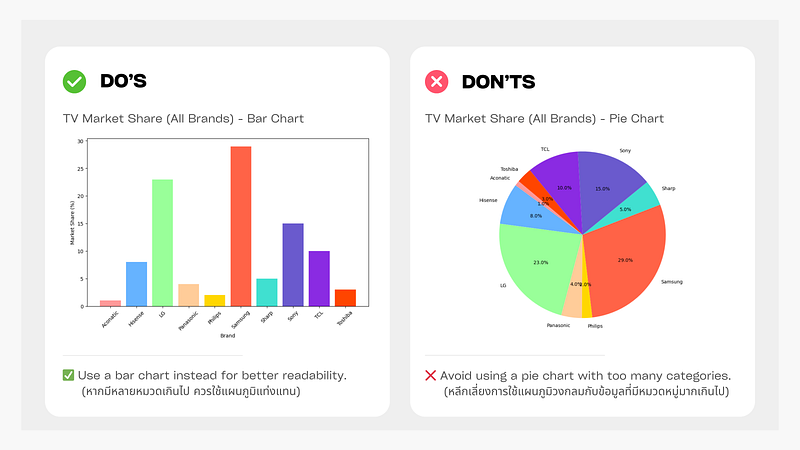
Figure: 10 Categories Bar Chart vs 10 Categories Pie Chart
3. Use Percentage Share for Accuracy
✅ Use percentage share for accurate representation.
❌ Don’t use raw sales data in a pie chart.
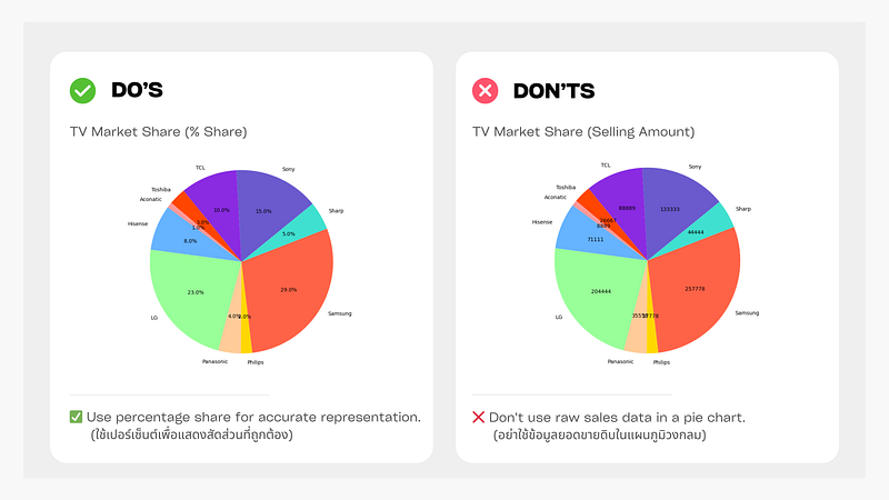
Figure: Percentage Share vs Selling Amount
4. Sort Slices from Largest to Smallest
✅ Sort slices from largest to smallest (clockwise).
❌ No sorting makes comparison difficult.
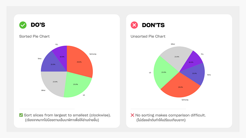
Figure: Sorted vs Unsorted Pie Chart
5. Use Distinct and Contrasting Colors
✅ Choose distinct and contrasting colors for better readability.
❌ Avoid using similar shades; it makes slices hard to distinguish.
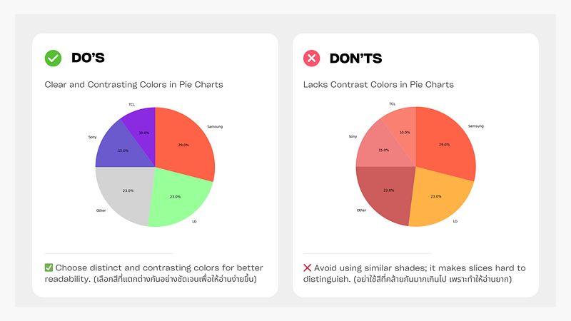
Figure: Clear and Contrasting Colors vs Lack of Contrast Pie Chart
6. Highlight Key Slices Effectively
✅ Use distinct colors and highlight only one key slice.
❌ Avoid exploding multiple slices and using dull colors.
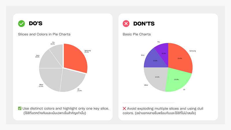
Figure: Highlight Key Slices vs Non-Highlighted Pie Chart
7. Label Values Directly
✅ Directly labeling slices improves readability.
❌ Avoid using a separate legend; it forces extra eye movement.
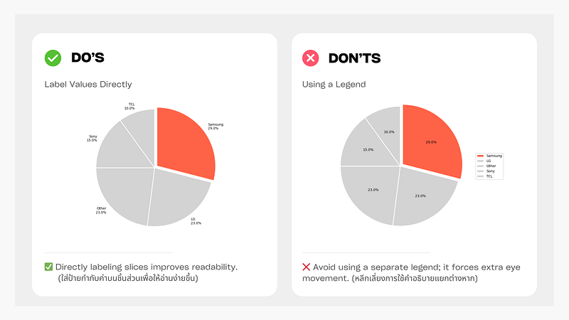
Figure: Label Values Directly vs Separate Legend Pie Chart
8. Use a Bar Chart When Differences Are Small
✅ Use a bar chart for better comparison when values are close.
❌ Pie charts can make small differences hard to see
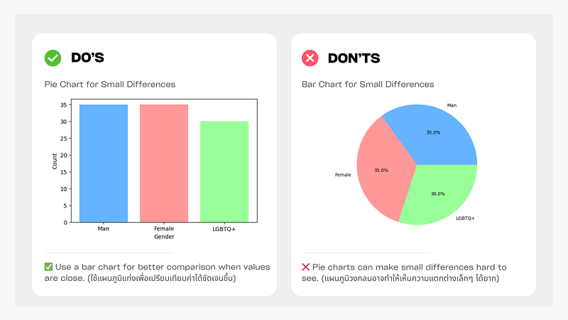
Figure: Bar Chart vs Pie Chart for Small Differences
9. Pie Chart Variations for Better Readability (Optional)
✅ Exploded Pie Chart — Highlights a key slice for emphasis.
✅ Donut Chart — Creates better data visualization with a clean look.
✅ Pie Chart with Breakdown — Helps show details of grouped categories (e.g., “Other”).
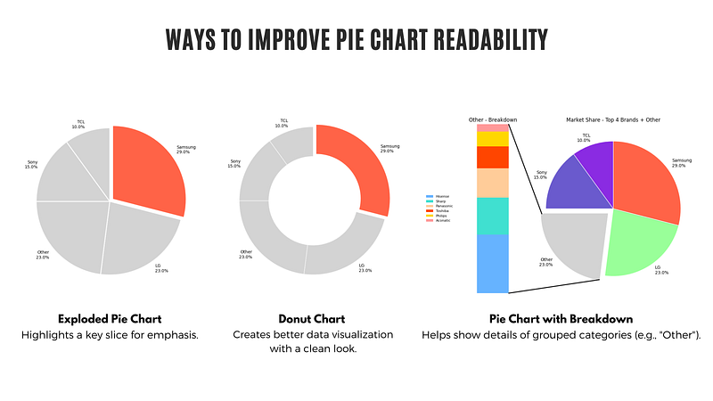
Figure: Exploded Pie Chart, Donut Chart, and Pie Chart with Breakdown
By following these best practices, you can create pie charts that are visually appealing and easy to interpret. Pie charts work best for simple comparisons, but they are not always the ideal choice for all data types. If you need to compare multiple categories or show trends over time, bar charts might be a better option.
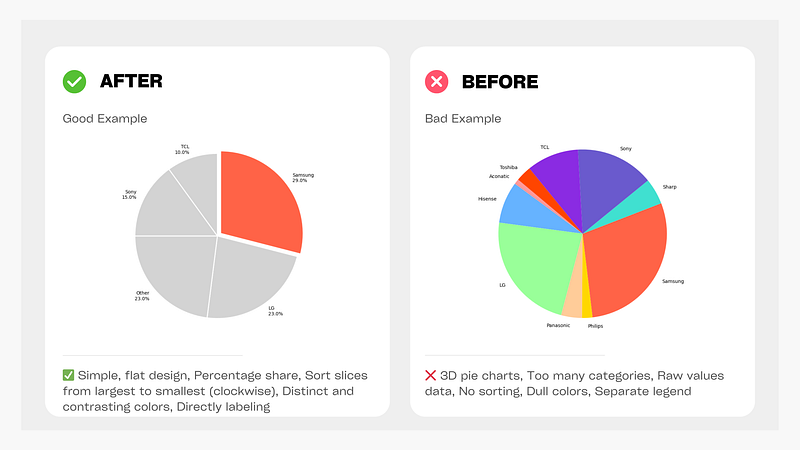
Figure: Before and After Pie Chart
🚀 Stay tuned for the next episode, where we’ll explore Best Practices for Bar Charts! 🚀
Data Science Explore the world of data science with Donato_Story
Dashboard Discover the power of data visualization with Donato_Story
Donato_Journey Join me on my journey (Thai version)
Course_Review Discover the training courses with Donato_Story (Thai version)
Let’s Connect!
Your thoughts and feedback are invaluable. Feel free to share them in the comments or connect with me on
- Medium: medium.com/donato-story
- Facebook: web.facebook.com/DonatoStory
- Linkedin: linkedin.com/in/nattapong-thanngam
Originally published on Medium
Related

A Practical Guide to Building Agents
คู่มือปฏิบัติ: การสร้าง Agent ด้วย LLM โดย OpenAI

AI in the Enterprise โดย OpenAI
ถอดรหัสเคล็ดลับองค์กรระดับโลก ปลดล็อกศักยภาพ AI สร้างความได้เปรียบทางธุรกิจ
Best Practices for Bar Charts
Visualization Series — Episode 2

Best Practices for Line Charts
Visualization Series — Episode 3