Best Practices for Line Charts
Visualization Series — Episode 3
Connect with me and follow our journey: LinkedIn, Facebook
Welcome back to the Visualization Series!
In this series, we explore the world of data visualization, breaking down best practices to help you create effective and insightful charts.
As part of this series, you can explore best practices for various chart types, including:
Now, in this third episode, we dive into another essential chart type: the line chart.
Introduction to Line Charts
Line charts are one of the most powerful visualization tools for displaying trends and patterns over time. They connect data points using lines, making it easy to identify fluctuations, growth, or decline. Line charts are ideal when you need to:
- Show trends over time (daily, monthly, yearly data, etc.).
- Compare multiple series of data.
- Highlight seasonality or cyclic trends.
However, poor design choices can obscure insights and mislead viewers. This post will cover best practices for creating clear and accurate line charts, along with good and bad examples.
Best Practices for Line Charts
Before diving into specific improvements, it’s important to consider a few foundational rules:
- 1️⃣ Use Line Charts for Time Data Only:
✅ Use line charts exclusively for time-series data.
❌ Avoid using line charts for categorical data (e.g., product comparisons).
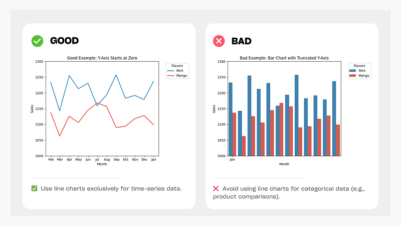
Figure: Line Chart vs Bar Chart for Time-Series Data
- 2️⃣ Time Should Flow from Left to Right:
✅ Ensure time progresses from left to right for better readability.
❌ Avoid reversing the timeline unless culturally necessary.
- 3️⃣ Use Consistent Time Intervals:
✅ Maintain equal time intervals (daily, monthly, yearly) for accurate comparisons.
❌ Avoid irregularly spaced intervals that distort trends.
- 4️⃣ Use Solid Lines for Clarity
✅ Use solid lines for primary data visualization.
✅ Use dashed or dotted lines only to indicate projections or missing data.
❌ Avoid excessive markers, patterns, or overly bold styling.
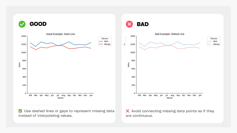
Figure: Simple vs. Overstyled Line Chart
- 5️⃣ Indicate Missing Data Clearly
✅ Use dashed lines or gaps to represent missing data instead of interpolating values.
❌ Avoid connecting missing data points as if they are continuous.
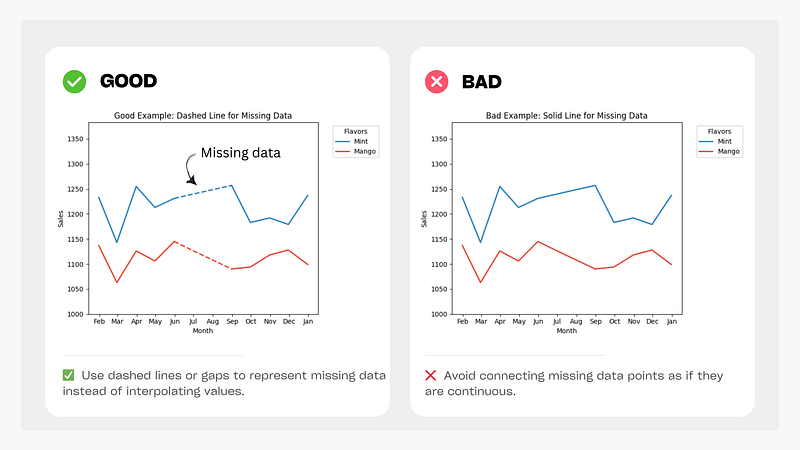
Figure: Dashed lines vs Solid lines for Missing Data
- 6️⃣ Aspect Ratio Matters
✅ A 16:9 aspect ratio is generally a good default.
✅ A taller ratio emphasizes fluctuations, while a wider one smooths trends.
❌ Avoid extreme aspect ratios that distort perceptions.
- 7️⃣ Avoid Unnecessary Chart Elements
✅ Minimize gridlines, borders, and shadows to reduce clutter.
❌ Avoid excessive visual elements that distract from the data.
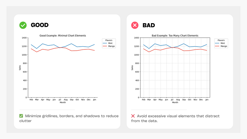
Figure: Clean vs. Unclean Line Chart
- 8️⃣ Choose an Appropriate Y-Axis Scale
✅ Start the y-axis at zero for accurate representation.
❌ Be cautious of truncated y-axes that exaggerate trends.
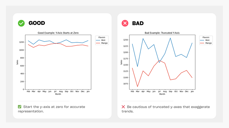
Figure: Proper Y-Axis vs. Misleading Y-Axis
💬 Note: If small fluctuations are important (e.g., stock prices), truncating the scale can be justified but should be clearly indicated.
- 9️⃣ Be Cautious with Dual Y-Axes
✅ Use a single axis whenever possible to avoid misleading correlations.
❌ Avoid using dual axes when a single-axis solution is clearer.
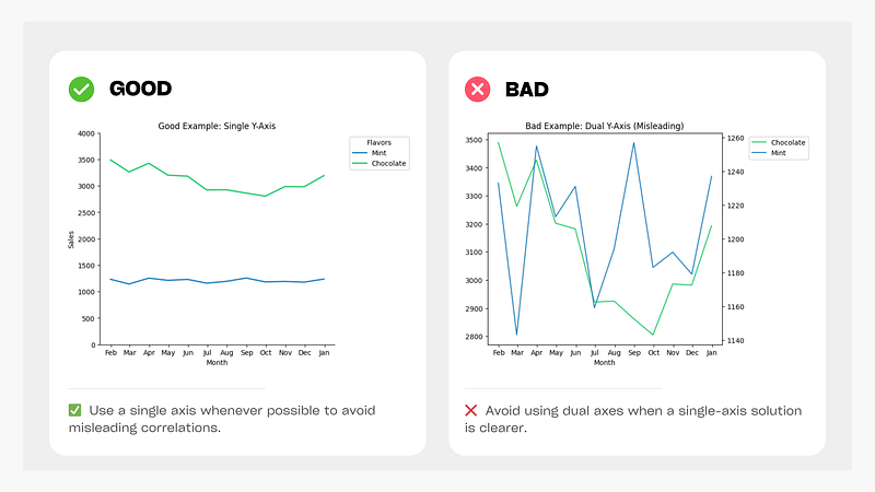
Figure: Single axis vs. Misleading Dual Axis Chart
💬 Note: When using dual Y-axes, ensure colors are clearly distinguished and that both axes are properly synchronized. For more details, refer to Datawrapper.
- 1️⃣0️⃣ Label the Line Directly
✅ Place labels directly on the line instead of relying on a legend.
❌ Avoid legends that require users to look back and forth between data and references.
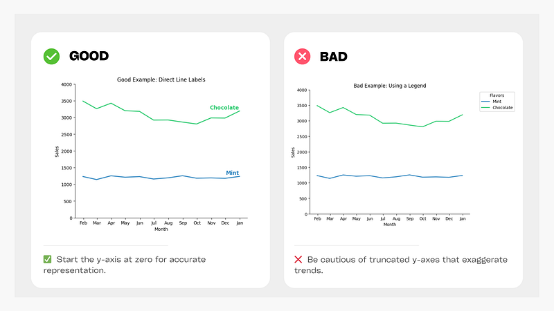
Figure: Direct Line Labels vs. Confusing Legend Placement
- 1️⃣1️⃣ Limit the Number of Lines (Avoid “Spaghetti Charts”)
✅ Keep the number of lines under 4–5 for clarity.
✅ Use small multiples instead of overloading a single chart.
❌ Avoid too many overlapping lines that make the chart unreadable.
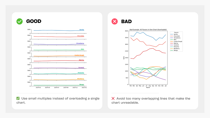
Figure: Well-Managed Line Chart vs. Spaghetti Chart
- 1️⃣2️⃣ Highlight Important Trends While Muting Others
✅ Keep key lines prominent while muting less important lines.
✅ Highlight one category distinctly while fading out others.
❌ Avoid giving equal emphasis to all lines when unnecessary.
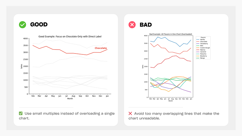
Figure: Focused Line Chart vs. Overloaded Chart
13) Use Solid Lines for Actual Data and Dotted Lines for Forecasting
✅ Use solid lines for actual data and dotted lines for forecasts.
❌ Avoid using solid lines for both actual and forecasted data, even in different colors.
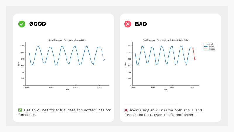
Figure: Proper Forecast Visualization vs. Misleading Solid Line Forecasting
By following these best practices, you can create clear, effective, and insightful line charts that communicate trends accurately without misleading the audience.
⚠️ Line charts are powerful tools, but they are not always the best choice. If your data is categorical rather than time-based, consider using bar charts instead.
🚀 Stay tuned for the next episode, where we’ll explore best practices for another essential chart type! 🚀
Data Science Explore the world of data science with Donato_Story
Dashboard Discover the power of data visualization with Donato_Story
Donato_Journey Join me on my journey (Thai version)
Course_Review Discover the training courses with Donato_Story (Thai version)
Let’s Connect!
Your thoughts and feedback are invaluable. Feel free to share them in the comments or connect with me on:
- Medium: medium.com/donato-story
- Facebook: web.facebook.com/DonatoStory
- LinkedIn: linkedin.com/in/nattapong-thanngam
Originally published on Medium
Related

A Practical Guide to Building Agents
คู่มือปฏิบัติ: การสร้าง Agent ด้วย LLM โดย OpenAI

AI in the Enterprise โดย OpenAI
ถอดรหัสเคล็ดลับองค์กรระดับโลก ปลดล็อกศักยภาพ AI สร้างความได้เปรียบทางธุรกิจ
Best Practices for Bar Charts
Visualization Series — Episode 2
Best Practices for Pie Charts
Visualization Series — Episode 1