Product detail and Store Dashboard
Retail Dashboard Series (2/3)
If you are interested in articles related to my experience, please feel free to contact me: linkedin.com/in/nattapong-thanngam
This article is part of a series about Retail Dashboard_. (Part 1: Sales Overview Dashboard),(Part 2: Product detail and Store Dashboard),_ and (Part 3: Customer dashboard and Cohort Analysis)
The same data set of Customer Analytics_._ (Part 1: Customer Profiling with Descriptive Analytics with SQL),(Part 2: Customer Segmentation with Clustering), (Part 3: Market Basket Analysis), and (Part 4: Product Recommendation)
Note:
- Data set from Dunnhumby_Carbo-Loading
Product Detail Dashboard

Pareto chart in Sales Overview Dashboard
- If we want to focus on specific product, we can apply Drill through function by creating new page and adding “brand” to “Drill through” fields
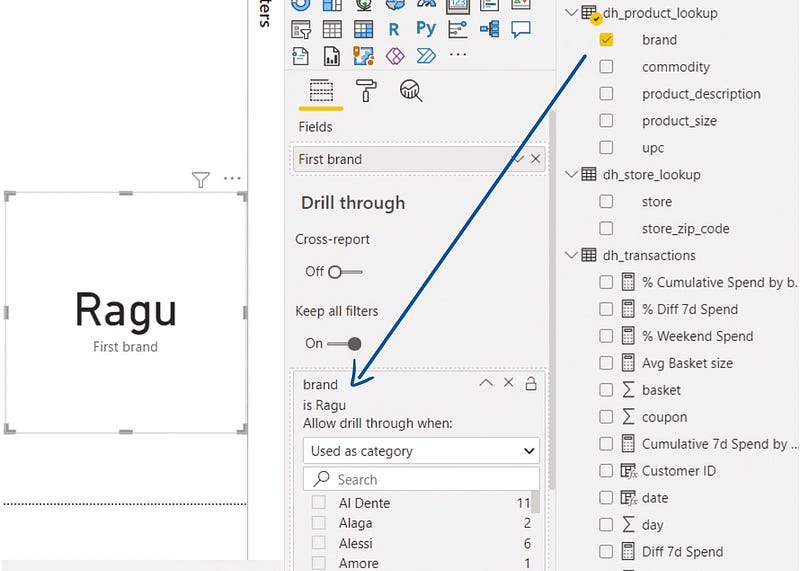
Drill through function
- Create new measures: “Total YTD Spend”, “Prev Total YTD Spend”, and “Product Penetration”

The formula in PowerBI (Image by Author)
- Visualization: Gauge chart, Setting as below
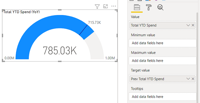
Select fields (Image by Author)
- We can use Treemap to show ratio of eash SKU in the brand.
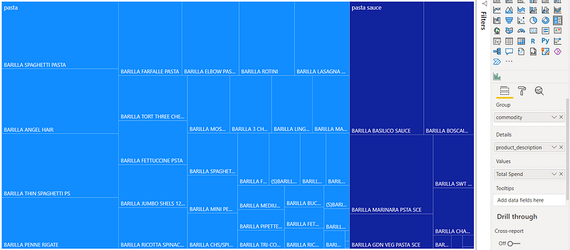
Select fields (Image by Author)
- We can use Scatter plot to show which stores create high/low revenue for the brand.
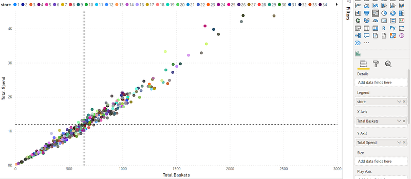
Select fields (Image by Author)
- Overview of Product detail dashboard
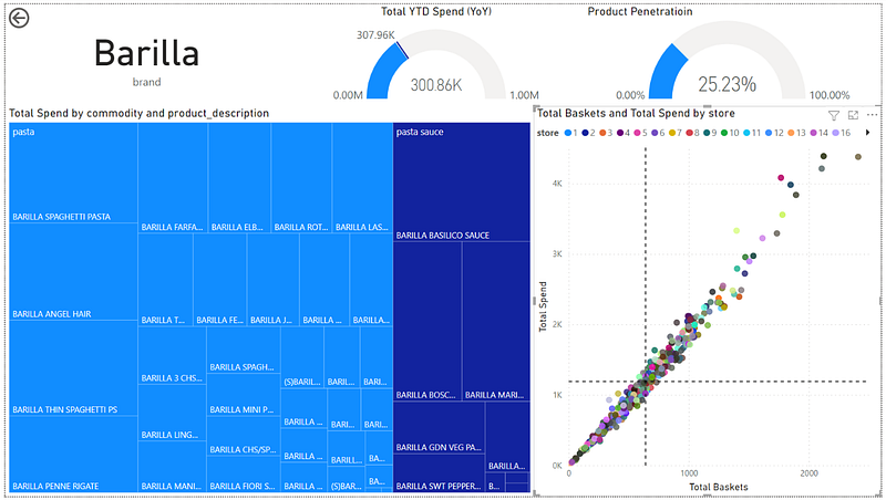
Product Detail Dashboard overview
- Example: Sales overview dashboard (Part 1) is shown overview for all products. If we want to focus on “Barilla” brand, we can use Drill through function. It will automatic to “Product Detail Dashboard” sheet.
- Year on Year sale drop (300.86 vs 307.96)
- 25.23% of customers used to purchase this product.
- Sale ratio between Pasta and Pasta source
- High/Low for quantity/revenue for each shop
Store Dashboard
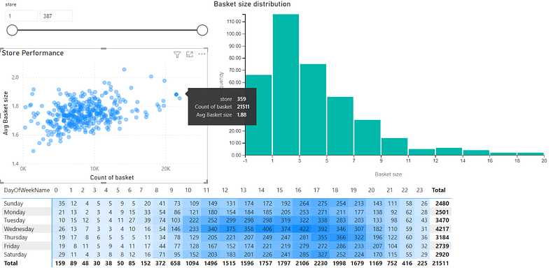
- I think we start from store performance that Scatter plot is selected to use.
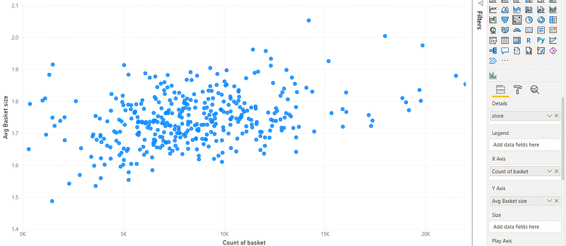
Select fields (Image by Author)
- Moreover, I load Histogram chart to show “basket size distribution”
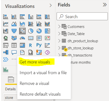
Click “Get more visuals” to import Histogram chart (Image by Author)
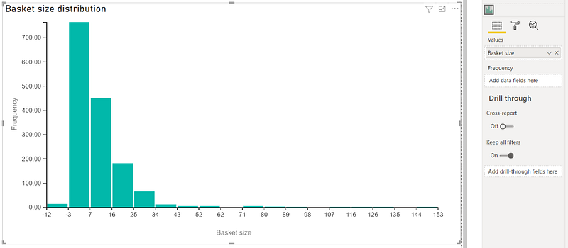
Select fields (Image by Author)
- Matrix table able to show high/low revenue contribution.

Select fields (Image by Author)
- Overview of store dashboard
Store dashboard overview
- Example: Store 359
- Very high number of basket and high average basket size.
- Most customer has average basket size at 1–3 USD
- 16:00–19:00 is the peak time
- Popular day are “Tuesday” and “Wednesday”
Note:
- Thank you skooldio for an excellent course (Hand-on PowerBI).
Please feel free to contact me, I am willing to share and exchange on topics related to Data Science and Supply Chain.
Facebook: facebook.com/nattapong.thanngam
Linkedin: linkedin.com/in/nattapong-thanngam
Originally published on Medium
Related

A Practical Guide to Building Agents
คู่มือปฏิบัติ: การสร้าง Agent ด้วย LLM โดย OpenAI

AI in the Enterprise โดย OpenAI
ถอดรหัสเคล็ดลับองค์กรระดับโลก ปลดล็อกศักยภาพ AI สร้างความได้เปรียบทางธุรกิจ

Best Practices for Bar Charts
Visualization Series — Episode 2

Best Practices for Line Charts
Visualization Series — Episode 3