Customer Analytics and Cohort analysis
Retail Dashboard Series (3/3)
If you are interested in articles related to my experience, please feel free to contact me: linkedin.com/in/nattapong-thanngam
This article is part of a series about Retail Dashboard_. (Part 1: Sales Overview Dashboard),(Part 2: Product detail and Store Dashboard),_ and (Part 3: Customer dashboard and Cohort Analysis)
The same data set of Customer Analytics_._ (Part 1: Customer Profiling with Descriptive Analytics with SQL),(Part 2: Customer Segmentation with Clustering), (Part 3: Market Basket Analysis), and (Part 4: Product Recommendation)
Note:
- Data set from Dunnhumby_Carbo-Loading
Customer Analytics
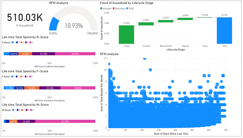
- I think we start from “% Active customer” by using Gauge chart.
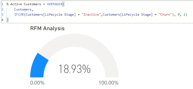
The formula in PowerBI (Image by Author)
- Use Waterfall chart to show the amount of customer type (“New”, “Resurrected”, “Repeat”, “Churn”, and “Inactive”.
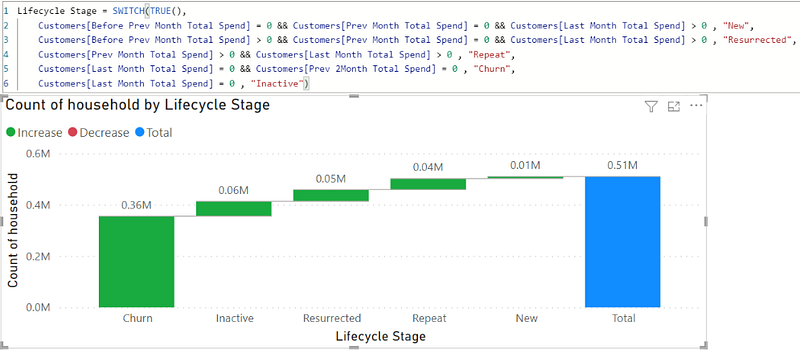
The formula in PowerBI (Image by Author)
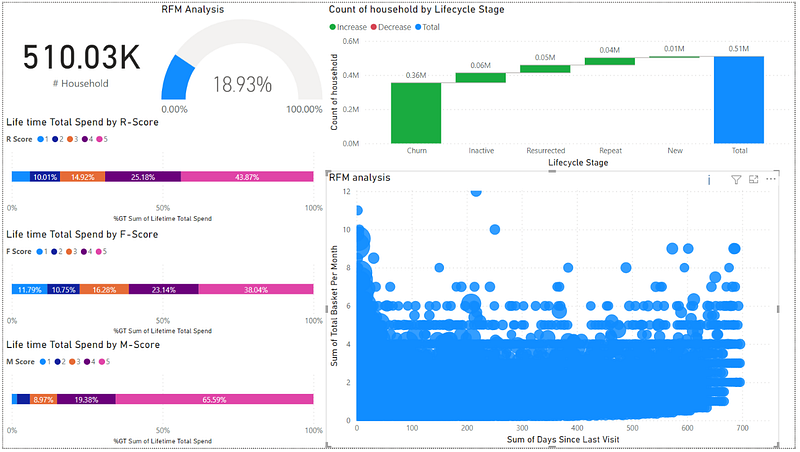
- Base on RFM model, separate customers into 5 groups (use percentile at 0-20, 21-40, 41–60, 61–80, and 81–100). Then, use Stacked bar chart to show the percentage of total lifetime spending based on R-score, F-score, and M-score.
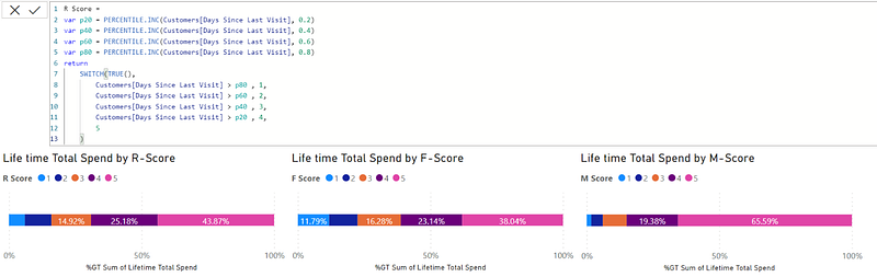
The formula in PowerBI (Image by Author)
- From Life time Total Spend by R-score graph, the customers who have high R-score (low days since last visit) have the biggest portion for spending.
- Use Scatter plot to show RFM information
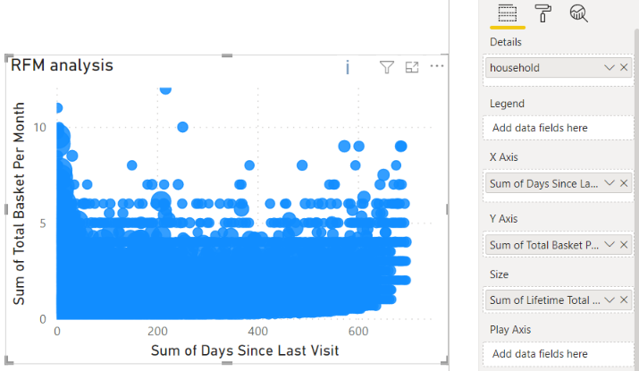
Select fields (Image by Author)
- Overview of Customer Analytics dashboard
Customer Analytics dashboard overview
- After customer segmentation based on RFM model, it can show revenue contribution. We should take care top percentage more than others.
Cohort Analysis
- Example only 14 months.
1. Customer Count (Count the customers coming, based on their acquisition month)
- For example, out of the 28686 customers who purchased in Apr 2020 for their first time, 6918 purchased again one month later.
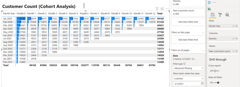
Select fields (Image by Author)
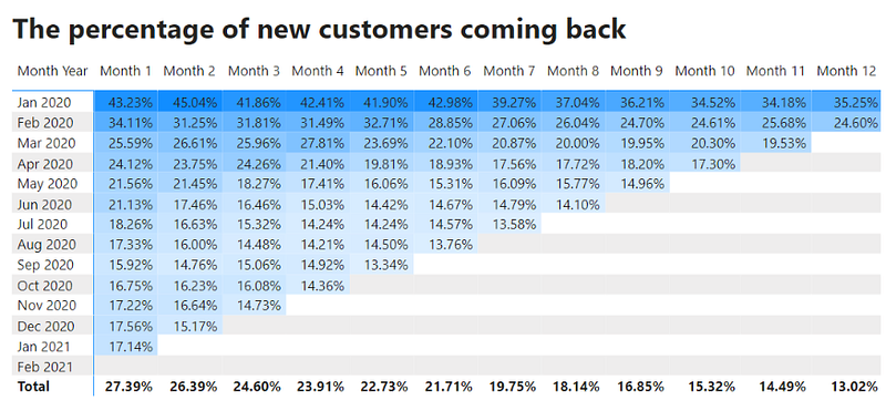
2. Percentage of new customers coming back
Percentage of new customers coming back
- For Apr 2020, 24.12% = 6918/28686
3. Average spend of customers
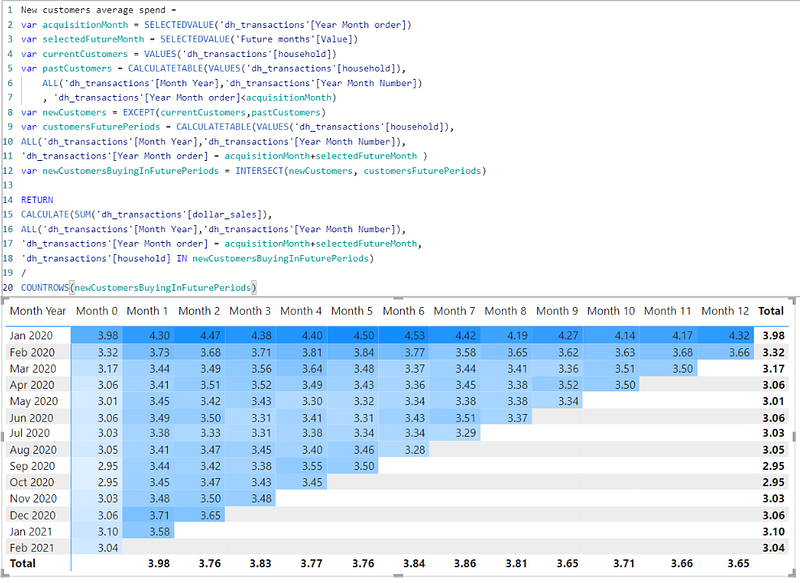
- The cohort is a very useful tool to show customer behavior month on month basis. I learn cohort coding from https://finance-bi.com/blog/power-bi-cohort-analysis/
Note:
- Thank you skooldio for an excellent course (Hand-on PowerBI).
- Thank you K.Luca for cohort coding that I learn from https://finance-bi.com/blog/power-bi-cohort-analysis/
Please feel free to contact me, I am willing to share and exchange on topics related to Data Science and Supply Chain.
Facebook: facebook.com/nattapong.thanngam
Linkedin: linkedin.com/in/nattapong-thanngam
Originally published on Medium
Related

A Practical Guide to Building Agents
คู่มือปฏิบัติ: การสร้าง Agent ด้วย LLM โดย OpenAI

AI in the Enterprise โดย OpenAI
ถอดรหัสเคล็ดลับองค์กรระดับโลก ปลดล็อกศักยภาพ AI สร้างความได้เปรียบทางธุรกิจ

Best Practices for Bar Charts
Visualization Series — Episode 2

Best Practices for Line Charts
Visualization Series — Episode 3