CSS 102 (Part 1)
จากโครงสร้างพื้นฐานสู่การออกแบบเว็บที่ดูดีขึ้นเรื่อย ๆ
การเรียน CSS ไม่ได้เป็นแค่การตกแต่งเว็บให้สวย แต่คือการเข้าใจ วิธีคิดในการจัด layout, ควบคุมองค์ประกอบต่าง ๆ และทำให้เว็บใช้งานได้จริงในหลายอุปกรณ์ บทความนี้จะพาคุณสร้างโปรเจกต์ทีละส่วนตามสไตล์ “เรียนไป ทำไป (Learn by Building)” ซึ่งเป็นวิธีที่ทำให้เข้าใจ CSS ได้ดีที่สุด
สำหรับใครที่ยังไม่ได้ดูเนื้อหาก่อนหน้านี้ สามารถเริ่มจากพื้นฐานได้ที่
- HTML 101
- CSS 101
- Built Resume ด้วย Basic HTML + CSS
🧱 โปรเจกต์วันนี้: เริ่มต้นสร้างเว็บร้านขายหูฟัง
ในบทนี้ เราจะเริ่มจากโครงสร้างโปรเจกต์ง่าย ๆ แล้วค่อย ๆ เติม CSS Layout เช่น Flexbox, Grid และ Component ต่าง ๆ เพื่อให้เว็บดูเป็นร้านค้าออนไลน์จริง
📁 โครงสร้างโปรเจกต์ (Project Structure)
project-folder/
│
├── index.html
├── reset.css
├── css/
│ └── main.css
└── images/
├── logo.png
├── headphone-hero.jpg
├── collection-studio.jpg
├── collection-gaming.jpg
├── collection-wireless.jpg
├── collection-lifestyle.jpg
├── headphone1.jpg
├── headphone2.jpg
├── headphone3.jpg
├── headphone4.jpg
└── about.jpg
🧩 โค้ดตั้งต้นของโปรเจกต์
ในตอนนี้เรามี 2 ไฟล์หลัก: index.html และ css/main.css
📄 ไฟล์: index.html
<main>
  <!-- Hero Section -->
  <section class="hero-section section">
    <h1 class="hero-title container">
      Premium Sound,<br />
      Delivered to You
    </h1>
  </section>

  <!-- Collection Section -->
  <section class="section container">
    <h2 class="section-title">Collections</h2>
    <ul class="collection-list">
      <li class="collection-item collection-item-one">
        <h3 class="collection-item-title">Studio Pro</h3>
        <p>
          High-definition audio tuned for creators and music professionals.
        </p>
      </li>
      <li class="collection-item collection-item-two">
        <h3 class="collection-item-title">Gaming</h3>
        <p>Immersive surround sound with noise-isolating microphone.</p>
      </li>
      <li class="collection-item collection-item-three">
        <h3 class="collection-item-title">Wireless</h3>
        <p>Lightweight comfort with long-lasting battery performance.</p>
      </li>
      <li class="collection-item collection-item-four">
        <h3 class="collection-item-title">Lifestyle</h3>
        <p>Modern minimalist design for everyday listening.</p>
      </li>
    </ul>
  </section>

  <!-- Product Section -->
  <section class="section container">
    <h2 class="section-title">Best Sellers</h2>
    <ul class="product-list">
      <li class="product-item">
        <img src="./images/headphone1.jpg" class="product-item-image" />
        <h3 class="product-item-title">Wave Studio X</h3>
        <p>Crystal-clear sound with premium leather ear cushions.</p>
        <p class="price">฿4,490</p>
      </li>

      <li class="product-item">
        <img src="./images/headphone2.jpg" class="product-item-image" />
        <h3 class="product-item-title">Aero Wireless</h3>
        <p>Ultra-light wireless headphones, 30 hours battery life.</p>
        <p class="price">฿3,290</p>
      </li>

      <li class="product-item">
        <img src="./images/headphone3.jpg" class="product-item-image" />
        <h3 class="product-item-title">BassMax 900</h3>
        <p>Powerful bass response with enhanced noise reduction.</p>
        <p class="price">฿5,990</p>
      </li>

      <li class="product-item">
        <img src="./images/headphone4.jpg" class="product-item-image" />
        <h3 class="product-item-title">Crystal Sound Lite</h3>
        <p>Sleek lifestyle design for daily music enjoyment.</p>
        <p class="price">฿2,490</p>
      </li>
    </ul>
  </section>

  <!-- About Section -->
  <section class="section container">
    <h2 class="section-title">Our Story</h2>
    <div class="about-content">
      <img src="./images/about.jpg" class="about-image" />
      <p class="about-description">
        We are passionate about delivering professional-grade audio to everyone.
        Our products combine engineering, comfort, and premium design to create
        the perfect listening experience for work, gaming, and everyday life.
      </p>
      <a href="/" class="button">Learn More</a>
    </div>
  </section>
</main>
🎨 ไฟล์: css/main.css
.hero-section {
background-image: url('../images/headphone-hero.jpg');
background-size: cover;
background-position: center;
}
.collection-item-one {
background-image: url('../images/collection-studio.jpg');
}
.collection-item-two {
background-image: url('../images/collection-gaming.jpg');
}
.collection-item-three {
background-image: url('../images/collection-wireless.jpg');
}
.collection-item-four {
background-image: url('../images/collection-lifestyle.jpg');
}
🎯 ผลลัพธ์ (Result)
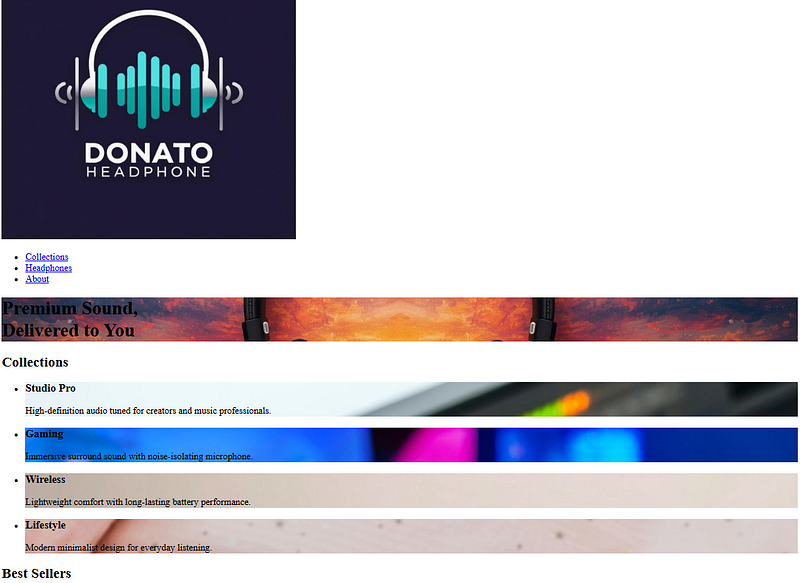
Figure: Output at Google Chrome
💡 ขั้นตอนที่ 1 — Reset Default CSS
Browser ทุกตัวมี default CSS เป็นของตัวเอง เช่น margin, padding, font-size
เพื่อให้เว็บเราดูเหมือนกันบนทุก browser เราจะ Reset มันด้วยไฟล์ minireset.css
✔ 1) สร้างไฟล์ css/reset.css (Ref)
/*! minireset.css v0.0.6 | MIT License | github.com/jgthms/minireset.css /
html,body,p,ol,ul,li,dl,dt,dd,blockquote,figure,fieldset,legend,textarea,pre,iframe,hr,h1,h2,h3,h4,h5,h6{margin:0;padding:0}
h1,h2,h3,h4,h5,h6{font-size:100%;font-weight:normal}
ul{list-style:none}
button,input,select{margin:0}
html{box-sizing:border-box}
,::before,::after{box-sizing:inherit}
img,video{height:auto;max-width:100%}
iframe{border:0}
table{border-collapse:collapse;border-spacing:0}
td,th{padding:0}
✔ 2) อัปเดต index.html ให้เชื่อม css/reset.css
📄 ไฟล์: index.html
<!-- Reset CSS -->
<link rel="stylesheet" href="css/reset.css" /> <!-- เพิ่มตรงนี้ -->

<!-- Main CSS -->
<link rel="stylesheet" href="css/main.css" />
<main>
  <!-- Hero Section -->
  <section class="hero-section section">
    <h1 class="hero-title container">
      Premium Sound,<br />
      Delivered to You
    </h1>
  </section>

  <!-- Collection Section -->
  <section class="section container">
    <h2 class="section-title">Collections</h2>
    <ul class="collection-list">
      <li class="collection-item collection-item-one">
        <h3 class="collection-item-title">Studio Pro</h3>
        <p>
          High-definition audio tuned for creators and music professionals.
        </p>
      </li>

      <li class="collection-item collection-item-two">
        <h3 class="collection-item-title">Gaming</h3>
        <p>Immersive surround sound with noise-isolating microphone.</p>
      </li>

      <li class="collection-item collection-item-three">
        <h3 class="collection-item-title">Wireless</h3>
        <p>Lightweight comfort with long-lasting battery performance.</p>
      </li>

      <li class="collection-item collection-item-four">
        <h3 class="collection-item-title">Lifestyle</h3>
        <p>Modern minimalist design for everyday listening.</p>
      </li>
    </ul>
  </section>

  <!-- Product Section -->
  <section class="section container">
    <h2 class="section-title">Best Sellers</h2>
    <ul class="product-list">
      <li class="product-item">
        <img src="./images/headphone1.jpg" class="product-item-image" />
        <h3 class="product-item-title">Wave Studio X</h3>
        <p>Crystal-clear sound with premium leather ear cushions.</p>
        <p class="price">฿4,490</p>
      </li>

      <li class="product-item">
        <img src="./images/headphone2.jpg" class="product-item-image" />
        <h3 class="product-item-title">Aero Wireless</h3>
        <p>Ultra-light wireless headphones, 30 hours battery life.</p>
        <p class="price">฿3,290</p>
      </li>

      <li class="product-item">
        <img src="./images/headphone3.jpg" class="product-item-image" />
        <h3 class="product-item-title">BassMax 900</h3>
        <p>Powerful bass response with enhanced noise reduction.</p>
        <p class="price">฿5,990</p>
      </li>

      <li class="product-item">
        <img src="./images/headphone4.jpg" class="product-item-image" />
        <h3 class="product-item-title">Crystal Sound Lite</h3>
        <p>Sleek lifestyle design for daily music enjoyment.</p>
        <p class="price">฿2,490</p>
      </li>
    </ul>
  </section>

  <!-- About Section -->
  <section class="section container">
    <h2 class="section-title">Our Story</h2>
    <div class="about-content">
      <img src="./images/about.jpg" class="about-image" />
      <p class="about-description">
        We are passionate about delivering professional-grade audio to everyone.
        Our products combine engineering, comfort, and premium design to create
        the perfect listening experience for work, gaming, and everyday life.
      </p>
      <a href="/" class="button">Learn More</a>
    </div>
  </section>
</main>
🎯 ผลลัพธ์ (Result)
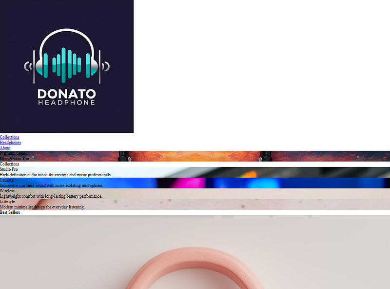
Figure: รูปจะเปลี่ยนนิดหน่อยหลัง reset CSS
💡 ขั้นตอนที่ 2 — เพิ่มฟอนต์ (Custom Fonts)
ตอนนี้เว็บเรายังใช้ฟอนต์ default ของ Browser ซึ่งยังไม่เข้ากับ Character ของร้าน SoundWave Store มากนัก เราจะเพิ่มฟอนต์ใหม่จาก Google Fonts เพื่อให้ทุก Section ของเว็บ “มีบุคลิกชัดเจนขึ้น”
ในบทนี้เราจะเลือกฟอนต์ 3 แบบ:
- Playwrite Norge → สำหรับ Title section
- Bitcount Prop Single → สำหรับ Hero section
- Noto Sans → สำหรับเนื้อหาทั่วไป (body text)
Step 1 — เลือกฟอนต์จาก Google Fonts
เข้าไปที่: https://fonts.google.com/
เลือกฟอนต์ 3 แบบ แล้วกด Get embed code → เราจะได้ code
- 1.1) Embed code in the of your html
- 1.2) Bitcount Prop Single: CSS class for a variable style
- 1.3) Playwrite NO: CSS class for a variable style
- 1.4) Noto Sans: CSS class for a variable style
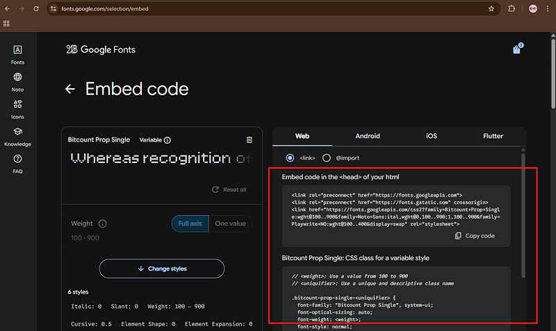
Step 2 — อัปเดต **index.html**
ให้คุณเพิ่ม embed code (1.1) ใน <head> แบบนี้:
📄 ไฟล์: index.html
<!-- Reset CSS -->
<link rel="stylesheet" href="css/reset.css" />

<!-- Google Fonts -->
<link rel="preconnect" href="https://fonts.googleapis.com">
<link rel="preconnect" href="https://fonts.gstatic.com" crossorigin>
<link href="https://fonts.googleapis.com/css2?family=Bitcount+Prop+Single:wght@100..900&family=Noto+Sans:ital,wght@0,100..900;1,100..900&family=Playwrite+NO:wght@100..400&display=swap" rel="stylesheet">

<!-- Main CSS -->
<link rel="stylesheet" href="css/main.css" />
<main>
  <!-- Hero Section -->
  <section class="hero-section section">
    <h1 class="hero-title container">
      Premium Sound,<br />
      Delivered to You
    </h1>
  </section>

  <!-- Collection Section -->
  <section class="section container">
    <h2 class="section-title">Collections</h2>
    <ul class="collection-list">
      <li class="collection-item collection-item-one">
        <h3 class="collection-item-title">Studio Pro</h3>
        <p>
          High-definition audio tuned for creators and music professionals.
        </p>
      </li>

      <li class="collection-item collection-item-two">
        <h3 class="collection-item-title">Gaming</h3>
        <p>Immersive surround sound with noise-isolating microphone.</p>
      </li>

      <li class="collection-item collection-item-three">
        <h3 class="collection-item-title">Wireless</h3>
        <p>Lightweight comfort with long-lasting battery performance.</p>
      </li>

      <li class="collection-item collection-item-four">
        <h3 class="collection-item-title">Lifestyle</h3>
        <p>Modern minimalist design for everyday listening.</p>
      </li>
    </ul>
  </section>

  <!-- Product Section -->
  <section class="section container">
    <h2 class="section-title">Best Sellers</h2>
    <ul class="product-list">
      <li class="product-item">
        <img src="./images/headphone1.jpg" class="product-item-image" />
        <h3 class="product-item-title">Wave Studio X</h3>
        <p>Crystal-clear sound with premium leather ear cushions.</p>
        <p class="price">฿4,490</p>
      </li>

      <li class="product-item">
        <img src="./images/headphone2.jpg" class="product-item-image" />
        <h3 class="product-item-title">Aero Wireless</h3>
        <p>Ultra-light wireless headphones, 30 hours battery life.</p>
        <p class="price">฿3,290</p>
      </li>

      <li class="product-item">
        <img src="./images/headphone3.jpg" class="product-item-image" />
        <h3 class="product-item-title">BassMax 900</h3>
        <p>Powerful bass response with enhanced noise reduction.</p>
        <p class="price">฿5,990</p>
      </li>

      <li class="product-item">
        <img src="./images/headphone4.jpg" class="product-item-image" />
        <h3 class="product-item-title">Crystal Sound Lite</h3>
        <p>Sleek lifestyle design for daily music enjoyment.</p>
        <p class="price">฿2,490</p>
      </li>
    </ul>
  </section>

  <!-- About Section -->
  <section class="section container">
    <h2 class="section-title">Our Story</h2>
    <div class="about-content">
      <img src="./images/about.jpg" class="about-image" />
      <p class="about-description">
        We are passionate about delivering professional-grade audio to everyone.
        Our products combine engineering, comfort, and premium design to create
        the perfect listening experience for work, gaming, and everyday life.
      </p>
      <a href="/" class="button">Learn More</a>
    </div>
  </section>
</main>
Step 3 — อัปเดต main.css ให้กำหนดฟอนต์สำหรับแต่ละส่วนของเว็บ
เราต้องการ “เห็นความต่าง” ของฟอนต์แต่ละตัวชัด ๆ ดังนั้นจะกำหนดแบบนี้:
🎨 ไฟล์: css/main.css
/* ---------------------------------- /
/ FONTS /
/ ---------------------------------- */
/* Bitcount Prop Single (ใช้กับ Hero Title) /
.bitcount-prop-single {
font-family: "Bitcount Prop Single", system-ui;
font-optical-sizing: auto;
font-weight: 600; / Hero เน้นเด่นหน่อย */
font-style: normal;
font-variation-settings:
"slnt" 0,
"CRSV" 0.5,
"ELSH" 0,
"ELXP" 0;
}
/* Playwrite NO (ใช้กับ Section Titles) */
.playwrite-no {
font-family: "Playwrite NO", cursive;
font-optical-sizing: auto;
font-weight: 300;
font-style: normal;
}
/* Noto Sans (ใช้เป็น default body font) */
.noto-sans {
font-family: "Noto Sans", sans-serif;
font-optical-sizing: auto;
font-weight: 400;
font-style: normal;
font-variation-settings: "wdth" 100;
}
/* ---------------------------------- /
/ APPLY DEFAULT FONT TO BODY /
/ ---------------------------------- */
body {
font-family: "Noto Sans", sans-serif;
color: #333;
line-height: 1.6;
}
/* ---------------------------------- /
/ APPLY FONT TO IMPORTANT AREAS /
/ ---------------------------------- */
/* Hero Title → ใช้ Bitcount Prop Single */
.hero-title {
font-family: "Bitcount Prop Single", system-ui;
font-size: 3rem;
line-height: 1.2;
color: white;
text-shadow: 0 2px 8px rgba(0, 0, 0, 0.3);
}
/* Section Title → ใช้ Playwrite NO */
.section-title {
font-family: "Playwrite NO", cursive;
font-size: 2rem;
margin-bottom: 1rem;
}
/* ---------------------------------- /
/ EXISTING IMAGE STYLES /
/ ---------------------------------- */
.hero-section {
background-image: url('../images/headphone-hero.jpg');
background-size: cover;
background-position: center;
}
.collection-item-one {
background-image: url('../images/collection-studio.jpg');
}
.collection-item-two {
background-image: url('../images/collection-gaming.jpg');
}
.collection-item-three {
background-image: url('../images/collection-wireless.jpg');
}
.collection-item-four {
background-image: url('../images/collection-lifestyle.jpg');
}
🎯 ผลลัพธ์ (Result)
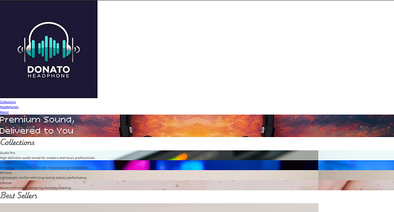
Figure: body ใช้ Noto Sans เป็นฟอนต์หลัก, Hero Title ใช้ Bitcount Prop Single, Section Title ใช้ Playwrite NO
💡 ขั้นตอนที่ 3 — ทำความเข้าใจ Box Model
ก่อนที่เราจะเริ่มตกแต่งหน้าเว็บให้สวยขึ้น ขั้นตอนสำคัญที่ต้องเข้าใจก่อนคือ Box Model เพราะทุก element ใน HTML ไม่ว่าจะเป็นข้อความ รูปภาพ ปุ่ม หรือ card — ล้วนถูกแสดงผลเป็น “กล่องสี่เหลี่ยม” เสมอ
🧱 Box Model ประกอบด้วย 4 ส่วน
- Content: เนื้อหาหลัก เช่น ตัวอักษร รูปภาพ หรือองค์ประกอบ HTML อื่น ๆ
- Padding: พื้นที่ที่อยู่ระหว่าง content → border (background-color จะกินถึง padding ด้วย)
- Border: เส้นรอบกรอบของกล่อง กำหนด:
- ความหนา (width)
- รูปแบบ (style)
- สี (color)
- มุมมน (border-radius) - Margin: พื้นที่ว่างภายนอกสุด ใช้สำหรับกำหนดช่องว่างระหว่างกล่องแต่ละใบ (margin จะไม่กิน background)
📝 สำคัญมาก:
ทั้ง 4 ส่วนสามารถดูได้ใน DevTools → Layout panel (Chrome)
🧰 Box Properties ที่ใช้บ่อย (จำเป็นมาก)
- width / height: กำหนดขนาดของกล่อง
- border: กำหนดเส้นรอบรูป เช่น
border: 1px solid #ccc;
border-radius: 8px;
- padding: กำหนดช่องว่างภายใน เช่น
padding: 24px;
- margin: กำหนดช่องว่างระหว่างกล่อง เช่น
margin-bottom: 16px;
📦 Box-sizing
ค่า default คือ content-box → width ไม่รวม padding และ border
ค่าใช้งานจริง (นิยมมาก) คือ border-box → width รวม padding + border แล้ว
🧱 Types of Box
HTML จะแสดงผล element เป็น 2 ประเภทหลัก:
- Block-level: ขยายเต็มบรรทัดเสมอ เช่น
div, section, p, h1, li, ul, header - Inline-level: แสดงต่อท้ายข้อความ เช่น
span, a, strong, em
การเลือกใช้ให้เหมาะสมช่วยควบคุม layout ได้ง่ายขึ้น
🎨 ไฟล์: css/main.css
ตอนนี้เราจะนำสิ่งที่เรียนมาไปปรับ layout ของเว็บ SoundWave Store ให้เป็นระเบียบมากขึ้นตาม requirement ของอาจารย์
- 🪜 กำหนดพื้นที่ “container” ให้เนื้อหาจัดกึ่งกลางเว็บ
- width: 100%;
- max-width: 1200px;
- margin: 0 auto; (กำหนดให้อยู่ตรงกลาง)
Note เติม code ด้านล่างของcss/reset.css
/* Layout Container */
.container {
width: 100%;
max-width: 1200px;
margin: 0 auto;
}
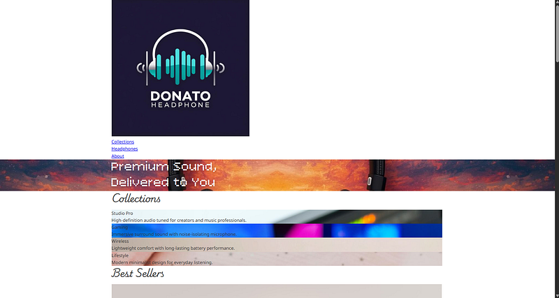
Figure: ตอนนี้เนื้อหาเว็บจะไม่ติดขอบซ้ายขวา แต่จัดกลางสวยงามแล้ว
- 🪜 ปรับ Hero Section ด้วย Box Model
- ให้ hero-section มีความสูง 720px
- Title ด้านในต้องมีpadding-top: 128px
.hero-section {
background-image: url('../images/headphone-hero.jpg');
background-size: cover;
background-position: center;
height: 720px; /* เพิ่มความสูง */
}
.hero-title {
padding-top: 128px; /* ขยับข้อความลง */
}
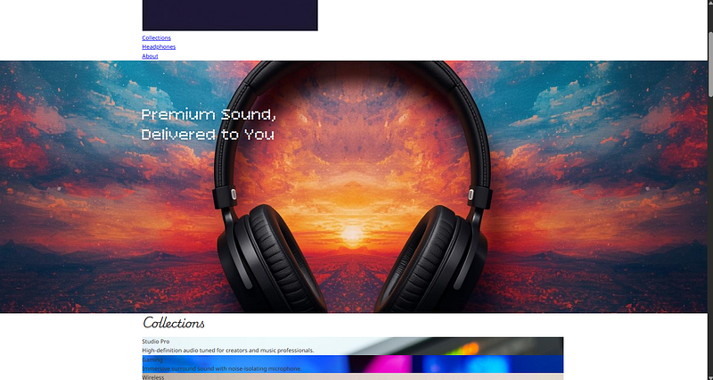
Figure: Hero section มีความสูงมากขึ้น
- 🪜 เพิ่มระยะห่างระหว่างแต่ละ Section
-.section→ margin-bottom: 64px
-.section-title→ margin-bottom: 24px
.section {
margin-bottom: 64px;
}
.section-title {
margin-bottom: 24px;
}
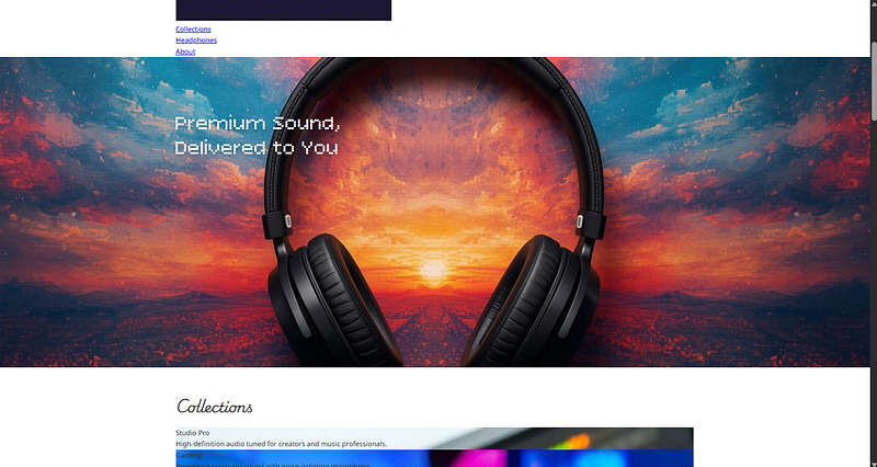
Figure: เพิ่มระยะห่างระหว่างแต่ละ Section ให้ดูไม่อึดอัด
- 🪜 ปรับ Box Properties ให้ Collection Section สวยขึ้น
-.collection-item→ padding 24px, border-radius 8px
-.collection-item-title→ margin-bottom 12px
/* Collection Section */
.collection-item {
padding: 24px;
border-radius: 8px;
}
.collection-item-title {
margin-bottom: 12px;
}
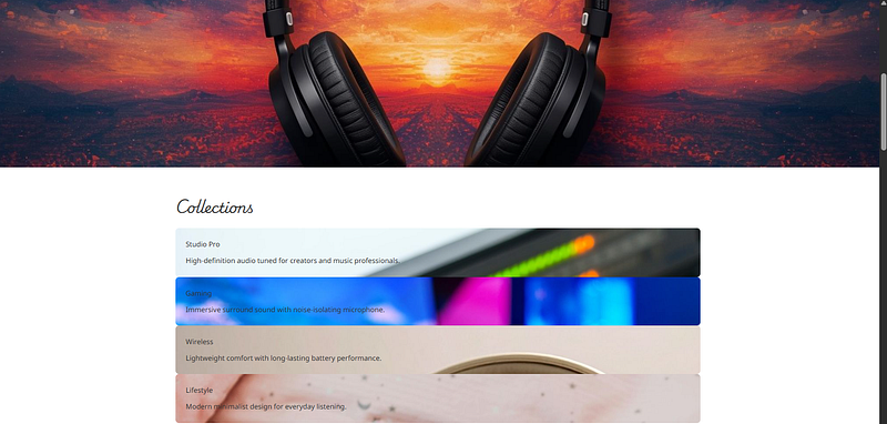
Figure: เพิ่มการ์ดแต่ละใบจะดูเป็น box ที่ชัดขึ้นมาก
- 🪜 ปรับ Box Properties ให้ Product Section
-.product-item→ width 1/3 ของพื้นที่, margin-bottom 16px
-.product-item-image
— border-radius 18px
— margin-bottom 12px
— object-fit: cover
-.product-item-title→ margin-bottom 8px, font-size 18px, font-weight 600
-.price→ margin-top 24px
/* Product Section */
.product-item {
width: calc(100% / 3);
margin-bottom: 16px;
}
.product-item-image {
width: 100%;
height: 240px; /* แนะนำเพิ่มเพื่อให้ object-fit ทำงานสวย */
border-radius: 18px;
object-fit: cover;
margin-bottom: 12px;
}
.product-item-title {
margin-bottom: 8px;
font-size: 18px;
font-weight: 600;
}
.price {
margin-top: 24px;
}
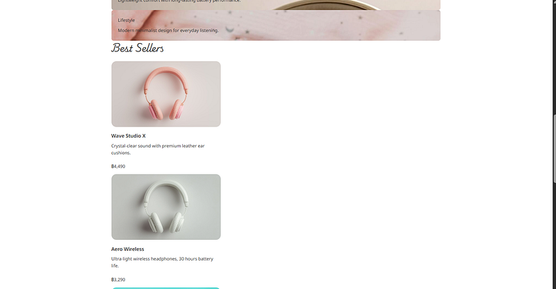
Figure: ปรับ Box Properties ให้ Product Section
🎨 ไฟล์: css/main.css (ถ้ารวมทุกขั้นตอนเข้าไป ควรได้แบบนี้)
/* --------------------------------------------------- /
/ FONTS /
/ --------------------------------------------------- */
.bitcount-prop-single {
font-family: "Bitcount Prop Single", system-ui;
font-optical-sizing: auto;
font-weight: 600;
font-style: normal;
font-variation-settings:
"slnt" 0,
"CRSV" 0.5,
"ELSH" 0,
"ELXP" 0;
}
.playwrite-no {
font-family: "Playwrite NO", cursive;
font-optical-sizing: auto;
font-weight: 300;
font-style: normal;
}
.noto-sans {
font-family: "Noto Sans", sans-serif;
font-optical-sizing: auto;
font-weight: 400;
font-style: normal;
font-variation-settings: "wdth" 100;
}
/* --------------------------------------------------- /
/ GLOBAL STYLES /
/ --------------------------------------------------- */
body {
font-family: "Noto Sans", sans-serif;
color: #333;
line-height: 1.6;
}
.container {
width: 100%;
max-width: 1200px;
margin: 0 auto;
}
/* --------------------------------------------------- /
/ TYPOGRAPHY /
/ --------------------------------------------------- */
/* Hero Title */
.hero-title {
font-family: "Bitcount Prop Single", system-ui;
font-size: 3rem;
line-height: 1.2;
color: white;
text-shadow: 0 2px 8px rgba(0, 0, 0, 0.3);
padding-top: 128px;
}
/* Section Title */
.section-title {
font-family: "Playwrite NO", cursive;
font-size: 2rem;
margin-bottom: 24px;
}
/* --------------------------------------------------- /
/ SPACING /
/ --------------------------------------------------- */
.section {
margin-bottom: 64px;
}
/* --------------------------------------------------- /
/ HERO SECTION /
/ --------------------------------------------------- */
.hero-section {
background-image: url('../images/headphone-hero.jpg');
background-size: cover;
background-position: center;
height: 720px;
}
/* --------------------------------------------------- /
/ COLLECTION SECTION /
/ --------------------------------------------------- */
.collection-item {
padding: 24px;
border-radius: 8px;
}
.collection-item-title {
margin-bottom: 12px;
}
.collection-item-one {
background-image: url('../images/collection-studio.jpg');
}
.collection-item-two {
background-image: url('../images/collection-gaming.jpg');
}
.collection-item-three {
background-image: url('../images/collection-wireless.jpg');
}
.collection-item-four {
background-image: url('../images/collection-lifestyle.jpg');
}
/* --------------------------------------------------- /
/ PRODUCT SECTION /
/ --------------------------------------------------- */
.product-item {
width: calc(100% / 3);
margin-bottom: 16px;
}
.product-item-image {
width: 100%;
height: 240px;
border-radius: 18px;
object-fit: cover;
margin-bottom: 12px;
}
.product-item-title {
margin-bottom: 8px;
font-size: 18px;
font-weight: 600;
}
.price {
margin-top: 24px;
}
💡 ขั้นตอนที่ 4 — Flexbox: ระบบจัดวาง Layout ที่ทำให้เว็บของคุณ “เป็นระเบียบขึ้นทันที”
หากในบทก่อนหน้า เราเรียนรู้เรื่อง Box Model ไปแล้ว (content, padding, border, margin) Flexbox คือ อีกก้าวสำคัญ ในการทำให้เว็บเราดู “เป็นระเบียบ”, “ปรับตัวได้กับหลายหน้าจอ”, และ “จัดตำแหน่งง่ายขึ้นแบบสุด ๆ”
4.1) Flexbox คืออะไร?
Flexbox (Flexible Box Layout) ป็นระบบจัด layout แบบ “มิติเดียว” (one-dimensional layout model) ซึ่งหมายถึง:
- ถ้าตั้งแกนหลัก → เรียงตามแนวนอน
- ถ้าตั้งแกนหลัก → เรียงตามแนวตั้ง
Flexbox ประกอบด้วย 2 ส่วนหลัก:
-
- Flex Container คือ “กล่องแม่” (parent element) ที่ครอบทุก Flex item
display: flex;
-
- Flex Items คือ element ที่อยู่ “ด้านใน” ของ container โดยตรง
จะได้รับพฤติกรรม flex โดยอัตโนมัติ
- Flex Items คือ element ที่อยู่ “ด้านใน” ของ container โดยตรง
4.2) แกนสำคัญของ Flexbox
Flexbox มีแกน 2 แบบ
- Main Axis (แกนหลัก): แนวที่ Flex items จะถูกจัดเรียง = แนวนอน
- Cross Axis (แกนขวาง): แนวตั้งฉากกับ main axis = แนวตั้ง
4.3) คำสั่งสำคัญใน Flexbox
1️⃣ justify-content — ควบคุมตำแหน่งตาม Main Axis
justify-content: flex-start;
justify-content: center;
justify-content: flex-end;
justify-content: space-between;
justify-content: space-around;
justify-content: space-evenly;
2️⃣ align-items — ควบคุมตำแหน่งตาม Cross Axis
align-items: flex-start;
align-items: center;
align-items: flex-end;
align-items: baseline;
align-items: stretch;
3️⃣flex-direction — กำหนดทิศการเรียง item
flex-direction: row; /* ค่า default */
flex-direction: column;
flex-direction: row-reverse;
flex-direction: column-reverse;
⚠️ สำคัญมาก
ถ้าเปลี่ยนแกน → การทำงานของ justify-content และ align-items ก็จะเปลี่ยนด้วย
4️⃣ flex-direction —จัดการ item ที่ล้น container
flex-wrap: wrap;
flex-wrap: nowrap; /* default */
ใช้มากใน layout ที่ต้องการให้ element พับลงเมื่อจอแคบ เช่น product grid
4.4) Flex Item Properties — (กำหนดพฤติกรรมของแต่ละกล่อง)
1️⃣ flex-basis — ขนาดเริ่มต้นของ item → ระบุความกว้างตามแกนหลัก เช่น:
flex-basis: 200px;
flex-basis: 30%;
❗ ไม่เท่ากับ width เสมอไป!
flex-basis มีความสำคัญสูงกว่า width เมื่อมี flexbox
2️⃣ flex-grow— อัตราการขยายตัว
ตัวเลขมาก → ได้พื้นที่มาก
ตัวเลข 0 → ไม่ขยายตัวเลย
flex-grow: 1;
3️⃣flex-shrink — อัตราการย่อขนาด
เมื่อติดขัดด้านพื้นที่ รายการไหนควรย่อมาก/น้อย
flex-shrink: 1;
4️⃣flex — shorthand รวม 3 ตัวเข้าด้วยกัน
flex: 1; /* grow=1 shrink=1 basis=0 /
flex: 1 0 200px; / grow shrink basis */
🧪 Project: Styling Menu Bar ด้วย Flexbox
ตอนนี้เราจะเปลี่ยน Menu Bar ด้านบนให้เป็น layout ที่ดูเป็นเว็บร้านค้าจริง
สิ่งที่ต้องการ:
- โลโก้ชิดซ้าย
- เมนูชิดขวา
- เมนูเรียงในแนวนอน
- แต่ละเมนูมีระยะห่างซ้าย 24px
- ทั้งแถบมีความสูง 72px
- ทั้งหมดต้องอยู่ตรงกลางในแนวดิ่ง
✅ เพิ่มโค้ดลงใน main.css
/* --------------------------------------------------- /
/ MENU BAR /
/ --------------------------------------------------- */
/* ขนาดโลโก้ */
.logo {
height: 20px;
}
/* Container หลักของเมนู */
.menu-bar {
display: flex;
justify-content: space-between;
align-items: center;
height: 72px;
}
/* ทำให้เมนูเรียงเป็นแนวนอน */
.nav-list {
display: flex;
}
/* กำหนดระยะห่างของแต่ละเมนู */
.nav-item {
margin-left: 24px;
}
🎯 ผลลัพธ์ (Result)
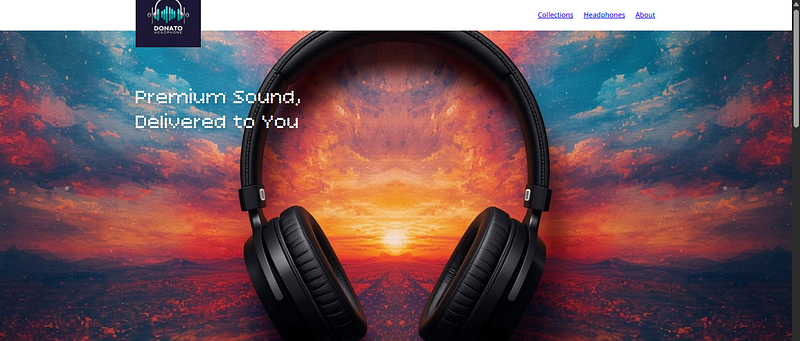
Figure: menu bar จะดูดีขึ้น
🧪 Project: Styling Menu Bar ด้วย Flexbox
เราจะจัดเลย์เอาต์ให้:
- รูปอยู่ซ้าย
- ข้อความ + ปุ่ม อยู่ขวา
- ทั้งหมดเป็น Flex row
🔄 อัปเดต index.html เพิ่ม wrapper .about-info
🔄 อัปเดต css/main.css
/* --------------------------------------------------- /
/ ABOUT SECTION /
/ --------------------------------------------------- */
.about-content {
display: flex;
}
.about-image {
width: 50%;
height: 320px;
border-radius: 8px;
object-fit: cover;
margin-right: 24px;
}
.about-info {
display: flex;
flex-direction: column;
justify-content: space-between;
}
🎯 ผลลัพธ์ (Result)
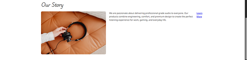
Figure: About Section จะดูเป็นระเบียบมากขึ้น
🧪 Project: Product List with Flex-wrap
ทำ product-list ให้พับลงอัตโนมัติเมื่อจอแคบ โดยใช้ flex-wrap
🔄 อัปเดต css/main.css
/* Product list layout */
.product-list {
display: flex;
flex-wrap: wrap;
/* เพื่อให้ padding ทำงานสวย */
margin-left: -16px;
margin-right: -16px;
}
.product-item {
padding: 0 16px; /* ระยะห่างซ้ายขวา */
}
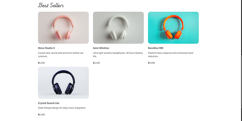
ถ้าทำถึงตรงนี้ ทุกคนจะได้ Code ดังนี้
📄 ไฟล์: index.html
<!-- Hero Section -->
<section class="hero-section section">
  <h1 class="hero-title container">
    Premium Sound,<br />
    Delivered to You
  </h1>
</section>


<!-- Collection Section -->
<section class="section container">
  <h2 class="section-title">Collections</h2>

  <ul class="collection-list">
    <li class="collection-item collection-item-one">
      <h3 class="collection-item-title">Studio Pro</h3>
      <p>High-definition audio tuned for creators and music professionals.</p>
    </li>

    <li class="collection-item collection-item-two">
      <h3 class="collection-item-title">Gaming</h3>
      <p>Immersive surround sound with noise-isolating microphone.</p>
    </li>

    <li class="collection-item collection-item-three">
      <h3 class="collection-item-title">Wireless</h3>
      <p>Lightweight comfort with long-lasting battery performance.</p>
    </li>

    <li class="collection-item collection-item-four">
      <h3 class="collection-item-title">Lifestyle</h3>
      <p>Modern minimalist design for everyday listening.</p>
    </li>
  </ul>
</section>


<!-- Product Section -->
<section class="section container">
  <h2 class="section-title">Best Sellers</h2>

  <ul class="product-list">
    <li class="product-item">
      <img src="./images/headphone1.jpg" class="product-item-image" />
      <h3 class="product-item-title">Wave Studio X</h3>
      <p>Crystal-clear sound with premium leather ear cushions.</p>
      <p class="price">฿4,490</p>
    </li>

    <li class="product-item">
      <img src="./images/headphone2.jpg" class="product-item-image" />
      <h3 class="product-item-title">Aero Wireless</h3>
      <p>Ultra-light wireless headphones, 30 hours battery life.</p>
      <p class="price">฿3,290</p>
    </li>

    <li class="product-item">
      <img src="./images/headphone3.jpg" class="product-item-image" />
      <h3 class="product-item-title">BassMax 900</h3>
      <p>Powerful bass response with enhanced noise reduction.</p>
      <p class="price">฿5,990</p>
    </li>

    <li class="product-item">
      <img src="./images/headphone4.jpg" class="product-item-image" />
      <h3 class="product-item-title">Crystal Sound Lite</h3>
      <p>Sleek lifestyle design for daily music enjoyment.</p>
      <p class="price">฿2,490</p>
    </li>
  </ul>
</section>


<!-- About Section -->
<section class="section container">
  <h2 class="section-title">Our Story</h2>

  <div class="about-content">
    <img src="./images/about.jpg" class="about-image" />

    <div class="about-info">
      <p class="about-description">
        We are passionate about delivering professional-grade audio to everyone.
        Our products combine engineering, comfort, and premium design to create
        the perfect listening experience for work, gaming, and everyday life.
      </p>
      <a href="/" class="button">Learn More</a>
    </div>
  </div>
</section>
🎨 ไฟล์: css/main.css
/* --------------------------------------------------- /
/ FONTS /
/ --------------------------------------------------- */
.bitcount-prop-single {
font-family: "Bitcount Prop Single", system-ui;
font-optical-sizing: auto;
font-weight: 600;
}
.playwrite-no {
font-family: "Playwrite NO", cursive;
font-weight: 300;
}
.noto-sans {
font-family: "Noto Sans", sans-serif;
font-weight: 400;
}
/* --------------------------------------------------- /
/ GLOBAL STYLES /
/ --------------------------------------------------- */
body {
font-family: "Noto Sans", sans-serif;
color: #333;
line-height: 1.6;
}
.container {
width: 100%;
max-width: 1200px;
margin: 0 auto;
}
/* --------------------------------------------------- /
/ TYPOGRAPHY /
/ --------------------------------------------------- */
.hero-title {
font-family: "Bitcount Prop Single", system-ui;
font-size: 3rem;
line-height: 1.2;
padding-top: 128px;
color: white;
text-shadow: 0 2px 8px rgba(0,0,0,0.3);
}
.section-title {
font-family: "Playwrite NO", cursive;
font-size: 2rem;
margin-bottom: 24px;
}
/* --------------------------------------------------- /
/ SPACING /
/ --------------------------------------------------- */
.section {
margin-bottom: 64px;
}
/* --------------------------------------------------- /
/ MENU BAR /
/ --------------------------------------------------- */
.logo {
height: 100px;
}
.menu-bar {
display: flex;
justify-content: space-between;
align-items: center;
height: 72px;
}
.nav-list {
display: flex;
}
.nav-item {
margin-left: 24px;
}
/* --------------------------------------------------- /
/ HERO SECTION /
/ --------------------------------------------------- */
.hero-section {
background-image: url('../images/headphone-hero.jpg');
background-size: cover;
background-position: center;
height: 720px;
}
/* --------------------------------------------------- /
/ COLLECTION SECTION /
/ --------------------------------------------------- */
.collection-item {
padding: 24px;
border-radius: 8px;
}
.collection-item-title {
margin-bottom: 12px;
}
.collection-item-one {
background-image: url('../images/collection-studio.jpg');
}
.collection-item-two {
background-image: url('../images/collection-gaming.jpg');
}
.collection-item-three {
background-image: url('../images/collection-wireless.jpg');
}
.collection-item-four {
background-image: url('../images/collection-lifestyle.jpg');
}
/* --------------------------------------------------- /
/ PRODUCT SECTION /
/ --------------------------------------------------- */
.product-list {
display: flex;
flex-wrap: wrap;
margin-left: -16px;
margin-right: -16px;
}
.product-item {
width: calc(100% / 3);
margin-bottom: 16px;
padding: 0 16px;
}
.product-item-image {
width: 100%;
height: 240px;
border-radius: 18px;
object-fit: cover;
margin-bottom: 12px;
}
.product-item-title {
margin-bottom: 8px;
font-size: 18px;
font-weight: 600;
}
.price {
margin-top: 24px;
}
/* --------------------------------------------------- /
/ ABOUT SECTION /
/ --------------------------------------------------- */
.about-content {
display: flex;
}
.about-image {
width: 50%;
height: 320px;
border-radius: 8px;
object-fit: cover;
margin-right: 24px;
}
.about-info {
display: flex;
flex-direction: column;
justify-content: space-between;
}
💡 ขั้นตอนที่ 5 — Grid Layout
หลังจากที่เราฝึก Flexbox สำหรับงาน Layout แบบมิติเดียว (one-dimensional) เช่น การจัดเมนู, การจัดแถวสินค้า, การจัดคอนเทนต์ซ้าย-ขวา หัวข้อนี้เราจะก้าวไปอีกขั้นด้วย CSS Grid ซึ่งเหมาะกับงาน Layout แบบสองมิติเต็มรูปแบบ
Grid สามารถควบคุมได้ทั้ง
- แนวนอน (columns)
- แนวตั้ง (rows)
- ตำแหน่งแบบกริด (area)
เหมาะมากสำหรับงานต่อไปนี้:
- Gallery / Product List
- Collection Section ที่ต้องการ layout แตกต่างกันในแต่ละกล่อง
- Landing page ที่มี banner + side content
🔥 5.1 ทำความเข้าใจ Grid Layout
CSS Grid ประกอบด้วย 2 องค์ประกอบหลัก:
1) Grid Container: คือ element ที่ใส่
display: grid;
เป็น “แม่” ที่กำหนดรูปแบบตาราง
2) Grid Items: คือ element เด็กทั้งหมดที่อยู่ใน Container เดียวกัน จะถูกกำหนดให้เป็น grid item โดยอัตโนมัติ
🔧 5.2 Grid Terminology (คำศัพท์สำคัญ)
- Grid Line: เส้นแบ่งแถว (row line) และคอลัมน์ (column line)
- Grid Cell: ช่องเล็ก ๆ ที่เกิดจากจุดตัดของ row × column
- Grid Track: ระยะระหว่าง 2 grid lines (แถว / คอลัมน์)
- Grid Area: พื้นที่ที่กินหลายช่อง → เหมาะกับการจัด layout แบบ Hero / Collection
🧩 5.3 Defining Grid Template
เริ่มต้นจากกำหนดจำนวน “คอลัมน์” และ “แถว”
.collection-list {
display: grid;
grid-template-columns: 1fr 1fr 1fr 1fr;
grid-template-rows: 1fr 1fr;
}
fr คืออะไร?
- fr = fraction
- 1fr คือ “กินพื้นที่เท่ากันตามสัดส่วนที่เหลือ” เช่น 1fr 2fr = คอลัมน์ซ้าย 1 ส่วน ขวา 2 ส่วน
💡 5.4 Assign Grid Item Position
เช่น กล่องใหญ่ “Studio Pro” ให้กิน 2 คอลัมน์ 2 แถว
grid-column-start: 1;
grid-column-end: span 2;
grid-row-start: 1;
grid-row-end: span 2;
📏 5.5 Grid Gap
ใช้กำหนดระยะห่างของ Grid
row-gap: 16px;
column-gap: 16px;
หรือ shorthand:
gap: 16px;🧱 5.6 Grid Area (ขั้นสูง แต่โคตรสะดวก)
กำหนดชื่อให้แต่ละช่อง เช่น
"first first second third"
"first first fourth fourth"
แล้วโยน item เข้าตำแหน่งที่ต้องการง่าย ๆ
grid-area: first;
🧪 Update Code
- เปลี่ยน Collection Section → ใช้ “Grid Layout” แทน Flex แบบเดิม
- เปลี่ยน Product Section → ใช้ “3-column Grid Layout” แทน Flex-wrap
- ปรับ main.css ทั้งหมดให้เรียบร้อยแบบมืออาชีพ
ถ้าทำถึงตรงนี้ ทุกคนจะได้ Code ดังนี้
📄 ไฟล์: index.html
<!-- Reset CSS -->
<link rel="stylesheet" href="css/reset.css" />

<!-- Google Fonts -->
<link rel="preconnect" href="https://fonts.googleapis.com">
<link rel="preconnect" href="https://fonts.gstatic.com" crossorigin>
<link href="https://fonts.googleapis.com/css2?family=Bitcount+Prop+Single:wght@100..900&family=Noto+Sans:ital,wght@0,100..900;1,100..900&family=Playwrite+NO:wght@100..400&display=swap" rel="stylesheet">

<!-- Main CSS -->
<link rel="stylesheet" href="css/main.css" />
<main>
  <!-- Hero Section -->
  <section class="hero-section section">
    <h1 class="hero-title container">
      Premium Sound,<br />
      Delivered to You
    </h1>
  </section>

  <!-- Collection Section -->
  <section class="section container">
    <h2 class="section-title">Collections</h2>

    <ul class="collection-list">
      <li class="collection-item collection-item-one">
        <h3 class="collection-item-title">Studio Pro</h3>
        <p>High-definition audio tuned for creators and music professionals.</p>
      </li>

      <li class="collection-item collection-item-two">
        <h3 class="collection-item-title">Gaming</h3>
        <p>Immersive surround sound with noise-isolating microphone.</p>
      </li>

      <li class="collection-item collection-item-three">
        <h3 class="collection-item-title">Wireless</h3>
        <p>Lightweight comfort with long-lasting battery performance.</p>
      </li>

      <li class="collection-item collection-item-four">
        <h3 class="collection-item-title">Lifestyle</h3>
        <p>Modern minimalist design for everyday listening.</p>
      </li>
    </ul>
  </section>

  <!-- Product Section -->
  <section class="section container">
    <h2 class="section-title">Best Sellers</h2>

    <ul class="product-list">
      <li class="product-item">
        <img src="./images/headphone1.jpg" class="product-item-image" />
        <h3 class="product-item-title">Wave Studio X</h3>
        <p>Crystal-clear sound with premium leather ear cushions.</p>
        <p class="price">฿4,490</p>
      </li>

      <li class="product-item">
        <img src="./images/headphone2.jpg" class="product-item-image" />
        <h3 class="product-item-title">Aero Wireless</h3>
        <p>Ultra-light wireless headphones, 30 hours battery life.</p>
        <p class="price">฿3,290</p>
      </li>

      <li class="product-item">
        <img src="./images/headphone3.jpg" class="product-item-image" />
        <h3 class="product-item-title">BassMax 900</h3>
        <p>Powerful bass response with enhanced noise reduction.</p>
        <p class="price">฿5,990</p>
      </li>

      <li class="product-item">
        <img src="./images/headphone4.jpg" class="product-item-image" />
        <h3 class="product-item-title">Crystal Sound Lite</h3>
        <p>Sleek lifestyle design for daily music enjoyment.</p>
        <p class="price">฿2,490</p>
      </li>
    </ul>
  </section>

  <!-- About Section -->
  <section class="section container">
    <h2 class="section-title">Our Story</h2>

    <div class="about-content">
      <img src="./images/about.jpg" class="about-image" />

      <div class="about-info">
        <p class="about-description">
          We are passionate about delivering professional-grade audio to everyone.
          Our products combine engineering, comfort, and premium design to create
          the perfect listening experience for work, gaming, and everyday life.
        </p>
        <a href="/" class="button">Learn More</a>
      </div>
    </div>

  </section>
</main>
🎨 ไฟล์: css/main.css
/* --------------------------------------------------- /
/ FONTS /
/ --------------------------------------------------- */
.bitcount-prop-single {
font-family: "Bitcount Prop Single", system-ui;
font-optical-sizing: auto;
font-weight: 600;
font-style: normal;
font-variation-settings:
"slnt" 0,
"CRSV" 0.5,
"ELSH" 0,
"ELXP" 0;
}
.playwrite-no {
font-family: "Playwrite NO", cursive;
font-optical-sizing: auto;
font-weight: 300;
font-style: normal;
}
.noto-sans {
font-family: "Noto Sans", sans-serif;
font-optical-sizing: auto;
font-weight: 400;
font-style: normal;
font-variation-settings: "wdth" 100;
}
/* --------------------------------------------------- /
/ GLOBAL STYLES /
/ --------------------------------------------------- */
body {
font-family: "Noto Sans", sans-serif;
color: #333;
line-height: 1.6;
}
.container {
width: 100%;
max-width: 1200px;
margin: 0 auto;
}
.section {
margin-bottom: 64px;
}
/* --------------------------------------------------- /
/ TYPOGRAPHY /
/ --------------------------------------------------- */
.hero-title {
font-family: "Bitcount Prop Single", system-ui;
font-size: 3rem;
line-height: 1.2;
color: white;
text-shadow: 0 2px 8px rgba(0, 0, 0, 0.3);
padding-top: 128px;
}
.section-title {
font-family: "Playwrite NO", cursive;
font-size: 2rem;
margin-bottom: 24px;
}
/* --------------------------------------------------- /
/ MENU BAR /
/ --------------------------------------------------- */
.logo {
height: 100px;
}
.menu-bar {
display: flex;
justify-content: space-between;
align-items: center;
height: 72px;
}
.nav-list {
display: flex;
}
.nav-item {
margin-left: 24px;
}
/* --------------------------------------------------- /
/ HERO SECTION /
/ --------------------------------------------------- */
.hero-section {
background-image: url('../images/headphone-hero.jpg');
background-size: cover;
background-position: center;
height: 720px;
}
/* --------------------------------------------------- /
/ COLLECTION SECTION /
/ --------------------------------------------------- */
.collection-list {
display: grid;
grid-template-columns: 1fr 1fr 1fr 1fr;
grid-template-rows: 1fr 1fr;
/* ระยะห่างของ Grid */
row-gap: 16px;
column-gap: 16px;
}
.collection-item {
padding: 24px;
border-radius: 8px;
color: white;
background-size: cover;
background-position: center;
}
/* Layout ด้วย Grid Area */
.collection-list {
grid-template-areas:
"first first second third"
"first first fourth fourth";
}
.collection-item-one {
grid-area: first;
background-image: url('../images/collection-studio.jpg');
}
.collection-item-two {
grid-area: second;
background-image: url('../images/collection-gaming.jpg');
}
.collection-item-three {
grid-area: third;
background-image: url('../images/collection-wireless.jpg');
}
.collection-item-four {
grid-area: fourth;
background-image: url('../images/collection-lifestyle.jpg');
}
/* --------------------------------------------------- /
/ PRODUCT SECTION /
/ --------------------------------------------------- */
.product-list {
display: grid;
grid-template-columns: 1fr 1fr 1fr;
row-gap: 16px;
column-gap: 32px;
}
.product-item {
width: 100%;
}
.product-item-image {
width: 100%;
height: 240px;
border-radius: 18px;
object-fit: cover;
margin-bottom: 12px;
}
.product-item-title {
margin-bottom: 8px;
font-size: 18px;
font-weight: 600;
}
.price {
margin-top: 24px;
}
/* --------------------------------------------------- /
/ ABOUT SECTION /
/ --------------------------------------------------- */
.about-content {
display: flex;
}
.about-image {
width: 50%;
height: 320px;
border-radius: 8px;
object-fit: cover;
margin-right: 24px;
}
.about-info {
display: flex;
flex-direction: column;
justify-content: space-between;
}
🎯 ผลลัพธ์ (Result)
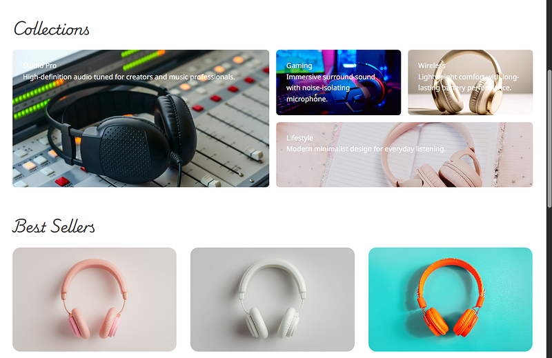
Figure: Collections ถูกปรับให้ดูดีขึ้น
💡 ขั้นตอนที่ 6— Positioning
หลังจากเราผ่าน Flexbox และ Grid ซึ่งเป็น layout model หลัก ๆ ในหัวข้อนี้เราจะเรียนรู้ “การวางตำแหน่ง (Positioning)” ซึ่งเป็นอีกหนึ่งเครื่องมือสำคัญในการจัดองค์ประกอบเฉพาะจุด เช่น:
- ป้าย NEW / SALE ที่มุมสินค้า
- ปุ่ม Social ที่ลอยอยู่มุมเว็บ
- Sticky Navigation Bar
- Tooltip / Popups / Floating Badge
- การแก้ปัญหาการซ้อนทับของ elements
Positioning คือการ “ดึง element ออกจาก normal flow” แล้ววางไว้ที่ตำแหน่งใหม่ตามต้องการ โดยใช้ properties:
position
top / right / bottom / left
z-index
🧱 6.1 ประเภทของ Positioning
- static: ค่า default ของทุก element
- relative: อ้างอิงจาก “ตำแหน่งเดิม” ของตัวเอง ขยับแบบเล็ก ๆ เช่น:
.position-test {
position: relative;
top: 12px;
}
- absolute: อ้างอิงจาก positioned ancestor (พ่อที่มี position เป็น relative/absolute/fixed/sticky) เหมาะกับการติดป้าย, overlay, badge
- fixed: ติดตำแหน่งกับ viewport เช่น:
- floating button
- social list
- back to top
- sticky footer - sticky: เป็น relative → จนกระทั่ง scroll ถึงจุดที่กำหนด → เปลี่ยนเป็น fixed เหมาะกับ:
- sticky navbar
- sticky sidebar menu
🏷️ 6.2 Project: เพิ่ม “Label NEW / SALE” ให้สินค้า
เป้าหมาย:
- เพิ่มป้ายลอยอยู่มุมของสินค้า 2 ชิ้นแรก
ขั้นตอนที่ 1 — เพิ่ม HTML
- ไปเพิ่มใน
<li class="product-item">สองอันแรก
📄 ไฟล์: index.html ค้นหา Product List แล้วแก้ 2 อันแรกแบบนี้
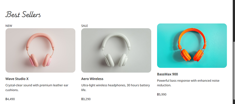
Figure: จะมี New, Sale เพิ่มเข้ามา
🎨 6.3 เพิ่ม Style ของ Product Label
เพิ่มใน main.css ช่วง “PRODUCT SECTION”
🎨 ไฟล์: css/main.css
/* Product Label /
.product-item {
position: relative; / element อ้างอิงสำหรับ absolute */
}
.product-label {
position: absolute;
top: 24px;
left: -8px;
background-color: #f87060;
color: white;
font-weight: 600;
border-radius: 8px;
padding: 12px;
width: fit-content;
}
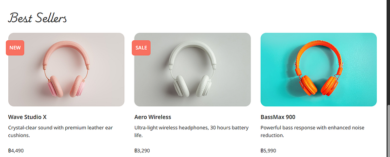
Figure: ป้าย NEW / SALE จะติดอยู่มุมซ้ายบน
🌐 6.4 Project: Floating Social Section (Facebook / Twitter / Line)
- ขั้นตอนที่ 1 — เพิ่ม HTML
เพิ่มไว้ “ท้ายสุดของ <body>” แต่ให้อยู่เหนือ </body>
📄 ไฟล์: index.html
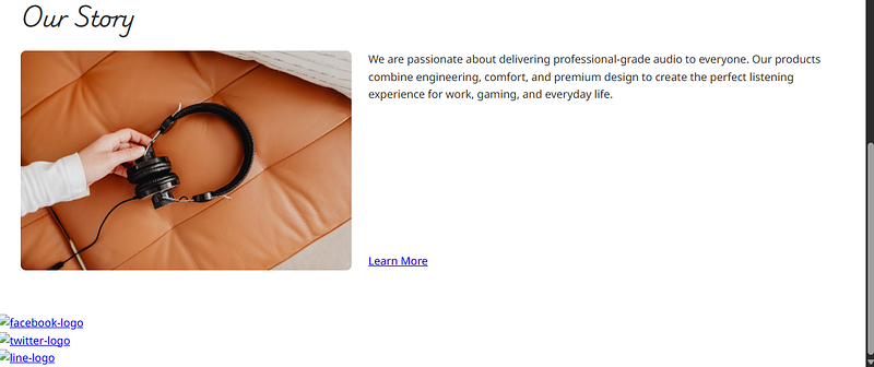
Figure: จะมี Social Section เพิ่มขึ้นมา
🎨 6.5 Style Social List (Fixed Position)
🎨 ไฟล์: css/main.css
/* --------------------------------------------------- /
/ SOCIAL SECTION /
/ --------------------------------------------------- */
.social-list {
position: fixed;
right: 72px;
bottom: 60px;
}
.social-logo {
width: 60px;
}
.social-item {
margin-bottom: 12px;
}
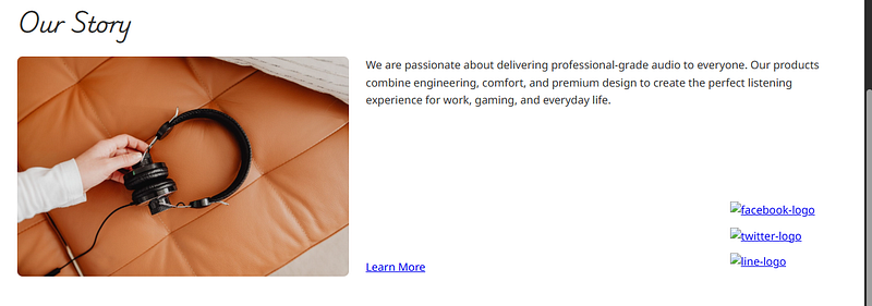
Figure: จะมี Social Section จะลอยอยู่มุมขวาล่างตลอดเวลา
📌 6.6 Project: Sticky Navigation Bar
ใน Construction แบบ Modern Website Navbar ควร “ลอยติดบนสุด” เวลา scroll
คุณมีเมนูแบบนี้แล้ว:
✨ ปรับใหม่ให้มี wrapper เพื่อให้ sticky ได้กำหนด background ได้ครบ แก้เป็น:
⚠️ อย่าลืมเพิ่ม
_menu-bar-wrapper_นี้ในไฟล์ index.html ของคุณนะครับ
🎨 main.css (เพิ่ม Sticky Navbar)
/* --------------------------------------------------- /
/ STICKY NAVIGATION BAR /
/ --------------------------------------------------- */
.menu-bar-wrapper {
position: sticky;
top: 0;
left: 0;
right: 0;
background-color: white;
z-index: 1000;
}
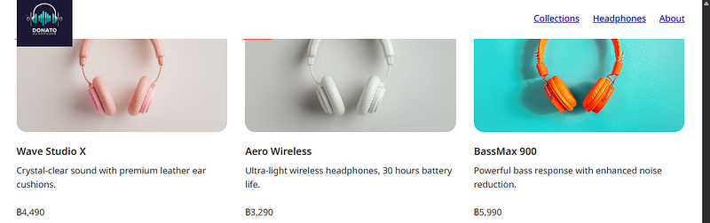
Figure: Navbar จะ “ลอยแปะบนสุด” เมื่อ scroll ลง
ถ้าทำถูกต้อง จะได้ Full code แบบนี้
📄 ไฟล์: index.html
<!-- Reset CSS -->
<link rel="stylesheet" href="css/reset.css" />

<!-- Google Fonts -->
<link rel="preconnect" href="https://fonts.googleapis.com">
<link rel="preconnect" href="https://fonts.gstatic.com" crossorigin>
<link href="https://fonts.googleapis.com/css2?family=Bitcount+Prop+Single:wght@100..900&family=Noto+Sans:ital,wght@0,100..900;1,100..900&family=Playwrite+NO:wght@100..400&display=swap" rel="stylesheet">

<!-- Main CSS -->
<link rel="stylesheet" href="css/main.css" />
<!-- Sticky Wrapper -->
<header class="menu-bar-wrapper">
  <div class="menu-bar container">
    <img src="./images/logo.png" alt="logo" class="logo" />
    <nav class="nav-menu">
      <ul class="nav-list">
        <li class="nav-item"><a href="/" class="nav-link">Collections</a></li>
        <li class="nav-item"><a href="/" class="nav-link">Headphones</a></li>
        <li class="nav-item"><a href="/" class="nav-link">About</a></li>
      </ul>
    </nav>
  </div>
</header>

<main>

  <!-- Hero Section -->
  <section class="hero-section section">
    <h1 class="hero-title container">
      Premium Sound,<br />
      Delivered to You
    </h1>
  </section>

  <!-- Collection Section -->
  <section class="section container">
    <h2 class="section-title">Collections</h2>

    <ul class="collection-list">

      <li class="collection-item collection-item-one">
        <h3 class="collection-item-title">Studio Pro</h3>
        <p>High-definition audio tuned for creators and music professionals.</p>
      </li>

      <li class="collection-item collection-item-two">
        <h3 class="collection-item-title">Gaming</h3>
        <p>Immersive surround sound with noise-isolating microphone.</p>
      </li>

      <li class="collection-item collection-item-three">
        <h3 class="collection-item-title">Wireless</h3>
        <p>Lightweight comfort with long-lasting battery performance.</p>
      </li>

      <li class="collection-item collection-item-four">
        <h3 class="collection-item-title">Lifestyle</h3>
        <p>Modern minimalist design for everyday listening.</p>
      </li>

    </ul>
  </section>

  <!-- Product Section -->
  <section class="section container">
    <h2 class="section-title">Best Sellers</h2>

    <ul class="product-list">

      <li class="product-item">
        <div class="product-label">NEW</div>
        <img src="./images/headphone1.jpg" class="product-item-image" />
        <h3 class="product-item-title">Wave Studio X</h3>
        <p>Crystal-clear sound with premium leather ear cushions.</p>
        <p class="price">฿4,490</p>
      </li>

      <li class="product-item">
        <div class="product-label">SALE</div>
        <img src="./images/headphone2.jpg" class="product-item-image" />
        <h3 class="product-item-title">Aero Wireless</h3>
        <p>Ultra-light wireless headphones, 30 hours battery life.</p>
        <p class="price">฿3,290</p>
      </li>

      <li class="product-item">
        <img src="./images/headphone3.jpg" class="product-item-image" />
        <h3 class="product-item-title">BassMax 900</h3>
        <p>Powerful bass response with enhanced noise reduction.</p>
        <p class="price">฿5,990</p>
      </li>

      <li class="product-item">
        <img src="./images/headphone4.jpg" class="product-item-image" />
        <h3 class="product-item-title">Crystal Sound Lite</h3>
        <p>Sleek lifestyle design for daily music enjoyment.</p>
        <p class="price">฿2,490</p>
      </li>

    </ul>
  </section>

  <!-- About Section -->
  <section class="section container">
    <h2 class="section-title">Our Story</h2>

    <div class="about-content">
      <img src="./images/about.jpg" class="about-image" />

      <div class="about-info">
        <p class="about-description">
          We are passionate about delivering professional-grade audio to everyone.
          Our products combine engineering, comfort, and premium design to create
          the perfect listening experience for work, gaming, and everyday life.
        </p>
        <a href="/" class="button">Learn More</a>
      </div>

    </div>
  </section>

</main>

<!-- Social Section -->
<ul class="social-list">
  <li class="social-item">
    <a href="/">
      <img src="images/social-logo/facebook-logo.svg" alt="facebook-logo" class="social-logo" />
    </a>
  </li>

  <li class="social-item">
    <a href="/">
      <img src="images/social-logo/twitter-logo.svg" alt="twitter-logo" class="social-logo" />
    </a>
  </li>

  <li class="social-item">
    <a href="/">
      <img src="images/social-logo/line-logo.svg" alt="line-logo" class="social-logo" />
    </a>
  </li>
</ul>
🎨 main.css
/* --------------------------------------------------- /
/ FONTS /
/ --------------------------------------------------- */
.bitcount-prop-single {
font-family: "Bitcount Prop Single", system-ui;
font-optical-sizing: auto;
font-weight: 600;
font-style: normal;
font-variation-settings:
"slnt" 0,
"CRSV" 0.5,
"ELSH" 0,
"ELXP" 0;
}
.playwrite-no {
font-family: "Playwrite NO", cursive;
font-optical-sizing: auto;
font-weight: 300;
font-style: normal;
}
.noto-sans {
font-family: "Noto Sans", sans-serif;
font-optical-sizing: auto;
font-weight: 400;
font-style: normal;
font-variation-settings: "wdth" 100;
}
/* --------------------------------------------------- /
/ GLOBAL STYLES /
/ --------------------------------------------------- */
body {
font-family: "Noto Sans", sans-serif;
color: #333;
line-height: 1.6;
}
.container {
width: 100%;
max-width: 1200px;
margin: 0 auto;
}
.section {
margin-bottom: 64px;
}
/* --------------------------------------------------- /
/ TYPOGRAPHY /
/ --------------------------------------------------- */
.hero-title {
font-family: "Bitcount Prop Single", system-ui;
font-size: 3rem;
line-height: 1.2;
color: white;
text-shadow: 0 2px 8px rgba(0, 0, 0, 0.3);
padding-top: 128px;
}
.section-title {
font-family: "Playwrite NO", cursive;
font-size: 2rem;
margin-bottom: 24px;
}
/* --------------------------------------------------- /
/ MENU BAR /
/ --------------------------------------------------- */
.menu-bar-wrapper {
position: sticky;
top: 0;
background-color: white;
z-index: 1000;
}
.logo {
height: 100px;
}
.menu-bar {
display: flex;
justify-content: space-between;
align-items: center;
height: 72px;
}
.nav-list {
display: flex;
}
.nav-item {
margin-left: 24px;
}
/* --------------------------------------------------- /
/ HERO SECTION /
/ --------------------------------------------------- */
.hero-section {
background-image: url('../images/headphone-hero.jpg');
background-size: cover;
background-position: center;
height: 720px;
}
/* --------------------------------------------------- /
/ COLLECTION SECTION /
/ --------------------------------------------------- */
.collection-list {
display: grid;
grid-template-columns: 1fr 1fr 1fr 1fr;
grid-template-rows: 1fr 1fr;
grid-template-areas:
"first first second third"
"first first fourth fourth";
row-gap: 16px;
column-gap: 16px;
}
.collection-item {
padding: 24px;
border-radius: 8px;
color: white;
background-size: cover;
background-position: center;
}
.collection-item-one {
grid-area: first;
background-image: url('../images/collection-studio.jpg');
}
.collection-item-two {
grid-area: second;
background-image: url('../images/collection-gaming.jpg');
}
.collection-item-three {
grid-area: third;
background-image: url('../images/collection-wireless.jpg');
}
.collection-item-four {
grid-area: fourth;
background-image: url('../images/collection-lifestyle.jpg');
}
/* --------------------------------------------------- /
/ PRODUCT SECTION /
/ --------------------------------------------------- */
.product-list {
display: grid;
grid-template-columns: 1fr 1fr 1fr;
row-gap: 16px;
column-gap: 32px;
}
.product-item {
width: 100%;
position: relative; /* สำหรับ label */
}
.product-item-image {
width: 100%;
height: 240px;
border-radius: 18px;
object-fit: cover;
margin-bottom: 12px;
}
.product-item-title {
margin-bottom: 8px;
font-size: 18px;
font-weight: 600;
}
.price {
margin-top: 24px;
}
/* Product Label */
.product-label {
position: absolute;
top: 24px;
left: -8px;
background-color: #f87060;
color: white;
font-weight: 600;
border-radius: 8px;
padding: 12px;
width: fit-content;
}
/* --------------------------------------------------- /
/ ABOUT SECTION /
/ --------------------------------------------------- */
.about-content {
display: flex;
}
.about-image {
width: 50%;
height: 320px;
border-radius: 8px;
object-fit: cover;
margin-right: 24px;
}
.about-info {
display: flex;
flex-direction: column;
justify-content: space-between;
}
/* --------------------------------------------------- /
/ SOCIAL SECTION /
/ --------------------------------------------------- */
.social-list {
position: fixed;
right: 72px;
bottom: 60px;
}
.social-logo {
width: 60px;
}
.social-item {
margin-bottom: 12px;
}
จบ Part 1 แล้ว! ตอนนี้คุณได้วางพื้นฐานเว็บครบชุดตั้งแต่ Reset CSS, ฟอนต์, Box Model, Flexbox, Grid จนถึง Positioning และสร้างหน้าเว็บ SoundWave Store ที่ดูเป็นมืออาชีพเรียบร้อยแล้ว 🎧✨
ในตอนถัดไป เราจะอัปเกรดเว็บให้ล้ำขึ้นด้วย Advanced Selectors, Hover/Active, Responsive Web, Breakpoints, Pseudo Elements, Animation & Transition รวมถึงการจัดโครงสร้างเว็บให้ใช้งานจริงแบบ Production ฝากติดตาม Part 2 และโปรเจกต์อื่น ๆ ด้วยนะครับ ❤️🚀
Data Science Explore the world of data science with Donato_Story
Dashboard Discover the power of data visualization with Donato_Story
Donato_Journey Join me on my journey (Thai version)
Course_Review Discover the training courses with Donato_Story (Thai version)
Let’s Connect!
Your thoughts and feedback are invaluable. Feel free to share them in the comments or connect with me on
- Medium: medium.com/donato-story
- Facebook: web.facebook.com/DonatoStory
- Linkedin: linkedin.com/in/nattapong-thanngam
Originally published on Medium
Related
CSS 101
เปลี่ยนหน้าเว็บ HTML ธรรมดา ให้สวยสะดุดตาด้วย CSS (ฉบับมือใหม่)
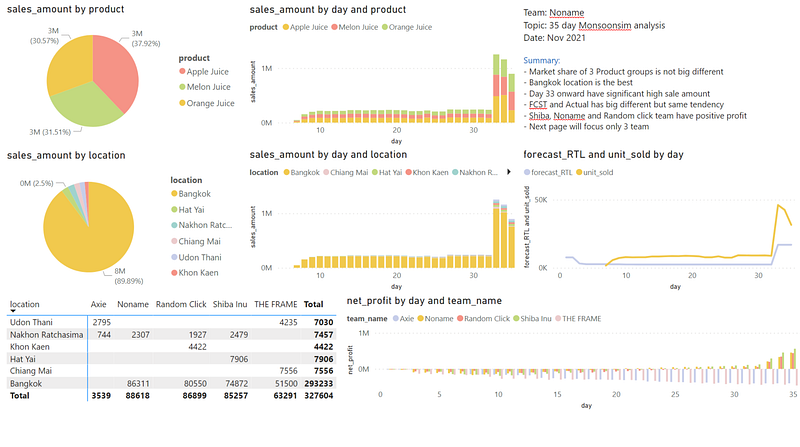
Dashboard for MonsoonSIM Analysis
NIDA class — Smart Logistic and supply chain automation

Everyday Text Use Cases with ChatGPT (EP3)
สำรวจ GPTs ตัวช่วยทำงานที่คุณอาจยังไม่เคยใช้

Generative AI for HR
ศิลปะการเขียน Prompt เพื่อผลลัพธ์ระดับมืออาชีพ