Basic Time Series Forecasting with R (Part 1)
Mean, Naive, Seasonal_Naive and drift method

If you are interested in articles related to my experience, please feel free to contact me: linkedin.com/in/nattapong-thanngam
This article is part of a series about Customer Analytics_._ (Part 1: Basic Time Series Forecasting with R),(Part 2: ETS, ARIMA, and Prophet Method by R_)_, (Part 3: ARIMA and Prophet Method by Python_)_
Overview:
- Data source name: Monthly CO2 Concentration (ppm) at Hawaii
- Program: R and use library(fpp3)
Step 1: Data Preparation and Data understanding
- Filter data: Screen only data in Y2010 onward
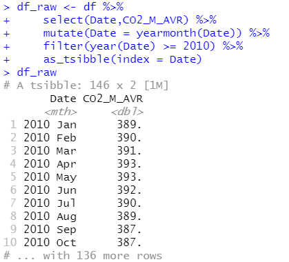
Filter data (Image by Author)
- Separate train & validate data set:
- Train = Jan.10 - Dec.19,
- Validate = Jan.20 - Feb.22
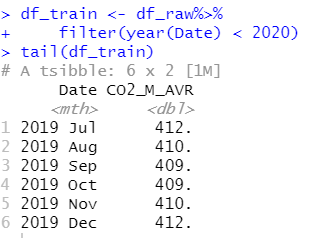
Train preparation (Image by Author)
- Data visualization:
- Overview CO2 emission → Use “Autoplot”
- Find seasonal → Use “gg_season” or “gg_subseries”
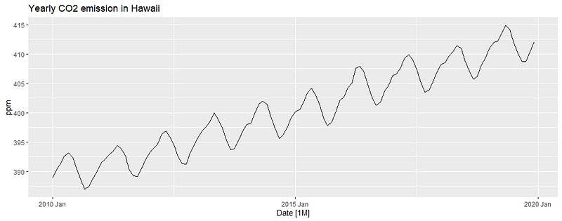
Autoplot function (Image by Author)
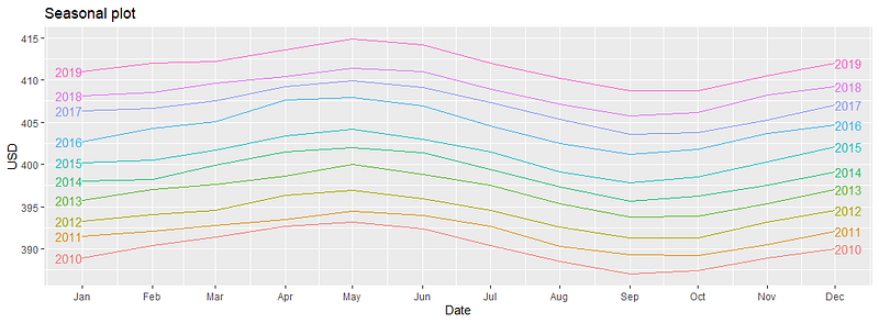
gg_season (Image by Author)
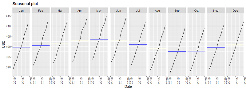
gg_subseries (Image by Author)
Step 2: Fit model
- Method: Mean, Naive, Seasonal_Naive and drift method
- Mean = FCST by using average history data
- Naive = FCST by using last data (only 1 data)
- Seasonal_Naive = FCST by using the last data at the same seasonal period (FCST July.20 by using July.19)
- Drift = FCST by using slope of history data
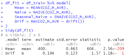
Fit model (Image by Author)
- Tidy = Find all parameters that are used for prediction (for example, Drift method use slope (b) to calculate prediction value)
Step 3: Model validation
- Forecast data = 26 period. (Jan.20 — Feb.22)
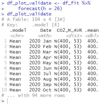
FCST data (Image by Author)
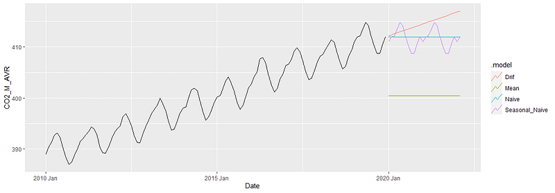
FCST data (Image by Author)
- Selected forecast error measurement: RMSE will be selected for this article. The best model = minimizes RMSE
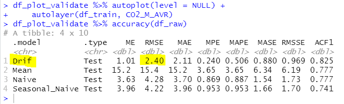
Model validation (Image by Author)
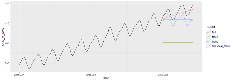
Actual data vs Predicted data (Image by Author)
Step 4: Residual plot
- Use: gg_tsresiduals → Good model has to follow the below criteria
- Independent (or uncorrelated) → bottom left graph shows dependent (ACF plot over the blue line) (not ok)
- Mean of residual = 0 → bottom right graph show ~0 (ok)
- Constant variance → Top graph show constant but has pattern (have correlation) (not ok)
- Normal distribution → bottom right graph show not normal distribution (not ok)
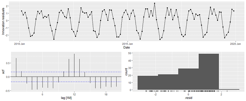
Residual plot (Image by Author)
Step 5: Forecast data
- Although the residual plot is not good, I will continue forecasting by using drift method (lowest RMSE) to show all of the forecasting steps.
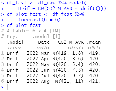
FCST data (Image by Author)
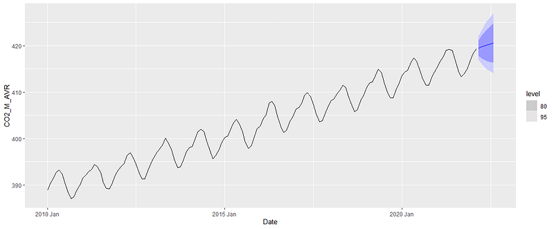
FCST data (Image by Author)
Note:
- Higher accuracy model is shown in (Part 2)
Please feel free to contact me, I am willing to share and exchange on topics related to Data Science and Supply Chain.
Facebook: facebook.com/nattapong.thanngam
Linkedin: linkedin.com/in/nattapong-thanngam